Art & Accessories
Art and accessories transform a house into a home. These are the layers that sit above architecture and furniture—the rugs underfoot, the paintings that catch your eye, the pottery on the mantelpiece, the pendant that defines a dining room. Yet choosing and styling these pieces presents a unique challenge: they must marry aesthetic ambition with practical reality. A beautiful rug that slides dangerously on laminate, a gallery wall that damages plaster, or a sculptural pendant that leaves your table in shadow all represent expensive mistakes that undermine both safety and style.
This guide introduces the core principles behind selecting, installing and styling the art and accessories that define UK homes. Whether you’re wrestling with how to hang frames in a rental, deciding between hand-knotted and machine-made rugs, or trying to display ceramics without creating visual clutter, the fundamentals remain consistent: understand materials, respect scale and proportion, plan for maintenance, and always prioritise function alongside beauty. The following sections break down each major category—from floor coverings to wall art, decorative objects to textiles—equipping you with the knowledge to make confident choices that endure.
Choosing Rugs That Work Hard in Real Homes
A rug anchors a room visually, but in everyday British homes it must also withstand muddy boots, pet claws, spilled wine and relentless foot traffic. The gulf between showroom appeal and five-year performance comes down to three factors: fibre choice, construction method and realistic maintenance expectations.
Material and Construction Fundamentals
Natural fibres dominate the rug market, each with distinct trade-offs. Wool remains the gold standard for high-traffic areas—naturally stain-resistant, flame-retardant and resilient when professionally cleaned. A quality wool rug in a hallway can deliver two decades of service if the pile density exceeds 100 knots per square inch. Jute and sisal, meanwhile, offer textural appeal and affordability but absorb moisture readily, often developing musty odours in conservatories or poorly ventilated rooms during autumn and winter.
Construction method matters as much as fibre. Hand-knotted rugs feature individual knots tied to the warp, creating a dense, durable structure that improves with age and can be repaired indefinitely. Power-loomed alternatives use mechanised weaving, producing consistent patterns at lower cost but with less resilience—pile flattening typically appears within seven to ten years in heavy-use zones. For hallways, staircases and family room centres, hand-knotted or hand-tufted wool justifies the premium.
Safety and Maintenance Essentials
Non-slip rug pads prevent the sliding that causes a significant proportion of domestic falls, yet many homeowners select pads based solely on thickness rather than grip technology. Look for rubber-latex hybrid pads with a waffle texture on both sides—these anchor to hard floors and grip rug backing without adhesives that degrade or stain. Replace pads every four to five years as the rubber hardens and loses traction.
Maintenance determines longevity. Vacuum wool rugs weekly using suction only (rotating brushes damage pile), treat spills immediately by blotting from the outer edge inward, and rotate rugs every six months to distribute wear and sun exposure evenly. For red wine, coffee or pet accidents, cold water and white vinegar often outperform commercial cleaners, which can set protein-based stains permanently.
Mastering Wall Art and Gallery Walls
Wall art personalises a space instantly, but poor installation damages both artwork and architecture. The challenge intensifies in rental properties, period homes with hidden cables, and rooms where visual balance proves elusive.
Hanging Without Damage or Danger
Picture hooks and nails leave minimal marks, yet homeowners frequently reach for adhesive strips that promise damage-free hanging. The reality is more nuanced: command strips fail predictably when applied to cold walls, textured wallpaper or recently painted surfaces where paint hasn’t fully cured. They’re rated by weight, but a 3 kg frame requires strips rated to 5 kg to account for dynamic load and environmental fluctuations. For rental properties, traditional brass hooks paired with quality filler for exit repairs often prove more reliable than failed adhesive experiments.
Before drilling into any wall built before the 1990s, invest in a cable and pipe detector with multi-sensor technology—basic stud finders miss diagonal cables or pipes embedded in plaster. Mark your proposed hanging point, then scan 30 cm in all directions. In period homes with lath-and-plaster walls, drill pilot holes to locate solid timber battens rather than relying on cavity fixings that pull free under load.
Composition and Spacing Principles
Gallery walls fail when spacing becomes arbitrary. The principle that creates cohesion: maintain consistent gaps between frames—typically 5 to 8 cm works across most domestic scales. Tighter spacing (3 to 5 cm) suits salon-style arrangements in larger rooms; wider gaps fragment the composition, transforming a curated wall into a scattered jumble. Before hammering a single nail, trace each frame on paper, cut out the templates, and arrange them on the floor until the composition balances.
The persistent myth that art hangs at « eye level » causes 60% of British homeowners to position work too high. The correct reference point: the centre of the artwork should sit 145 to 150 cm from the floor—average eye height for a standing viewer. In dining rooms where people sit, drop this 10 to 15 cm to maintain comfortable sight lines.
Knowing When to Refresh
Visual fatigue sets in when the same art occupies the same wall for years. Your eye stops registering it; the work becomes invisible wallpaper. Rotate wall art seasonally or biannually—swap a bold abstract for a quiet landscape in winter, replace bright prints with muted tones in summer. This practice refreshes a room without expenditure and allows you to rediscover pieces stored away.
Styling Decorative Objects With Intention
Decorative objects—vases, sculptures, bowls, candlesticks—add personality and texture, but the line between curated and cluttered is perilously thin. Mastering display comes down to understanding visual weight, repetition and the power of restraint.
The Rules of Visual Harmony
Grouping objects in odd numbers (three, five, seven) creates visual stability because the human eye seeks symmetry but finds perfect pairs static and predictable. Three objects of varying heights arranged in a triangle formation draw the eye naturally around the composition. Mix materials and finishes within each group—pair a matte ceramic vase with a brass candlestick and a wooden bowl—to create textural contrast without colour chaos.
Scale matters profoundly. A large sculpture on a narrow console table overwhelms the piece and the room; a small vase on a wide mantelpiece disappears. The guideline: decorative objects should occupy one-third to two-thirds of the surface width. A 120 cm mantel can support a central object 40 to 80 cm wide, flanked by smaller pieces if desired.
Choosing Pieces That Tell Your Story
High-street ornaments deliver instant gratification but rarely carry meaning. Craft-fair ceramics, artisan markets and independent makers produce work with provenance—you remember where you bought it, why it appealed, perhaps even the potter’s name. This narrative transforms an object from filler into a conversation piece. When selecting decorative items, ask: does this connect to a place I’ve visited, a material I love, or an aesthetic that reflects my taste? If the answer is no, walk away.
Avoiding Common Display Mistakes
The mantelpiece overload mistake happens gradually: you add a postcard, then a candle, then a small frame, until the surface becomes a visual jumble. The solution: edit ruthlessly every few months. Remove half of what’s displayed, store it, and reassess. Negative space—the empty areas around objects—allows each piece to register individually. Similarly, shelf displays fail when objects pack tightly without breathing room. Leave at least 5 to 8 cm between grouped items, and resist filling every shelf in a bookcase.
Integrating Art Into Your Home’s Architecture
Original paintings and limited-edition prints anchor a room’s colour palette and establish its mood, but integrating contemporary or abstract art into period architecture requires thoughtful framing and placement.
Abstract Painting in Period and Modern Spaces
A bold abstract canvas can thrive in a Victorian terrace if you establish visual links between old and new. Pull cushion and throw colours directly from the painting’s palette—this technique creates dialogue between artwork and furnishings, making the contemporary piece feel intentional rather than jarring. In rooms with ornate cornicing or ceiling roses, a large-scale abstract provides counterbalance, simplifying the visual field where architectural detail already dominates.
Conversely, minimalist spaces with clean lines and neutral palettes benefit from abstract work that introduces colour, texture or gestural energy. A single statement piece above a sofa in a 3-metre-wide room should measure at least 100 to 120 cm wide to avoid looking lost on the expanse of wall.
Framing and Presentation Choices
Framing decisions alter how art reads in a space. Gallery wrap (where the canvas wraps around the stretcher bars with no visible frame) suits minimalist and contemporary interiors, emphasising the artwork’s materiality. For period homes with picture rails and ornate mouldings, a substantial frame—even a simple white tray frame 4 to 6 cm deep—provides visual weight that honours the room’s architectural language.
When hanging abstract work in a room with Victorian plasterwork, choose frames in muted tones (off-white, dove grey, soft brass) rather than stark white or black, which can create harsh contrast. The frame should mediate between old and new, not compete with either.
Building an Accessible Art Collection
Original paintings appreciate differently than prints, but both have place in a thoughtfully curated home. Limited-edition prints (numbered and signed, typically in runs under 100) from emerging artists offer affordability and potential appreciation. London galleries and regional art fairs often feature graduate shows and emerging-artist exhibitions where work sells at accessible prices before the artist’s profile rises.
When buying art for investment and enjoyment, prioritise pieces that provoke an emotional response. Trends fade; personal connection endures. Attend open studio events, join gallery mailing lists, and build relationships with artists whose work resonates—many offer payment plans or smaller studies before committing to major pieces.
Displaying Pottery and Ceramics as Art
Hand-thrown pottery deserves display that honours its craftsmanship without transforming your home into a museum gift shop. The difference lies in editing, finish consistency and balancing decorative with functional pieces.
Curating Without the Gift Shop Effect
The gift shop look happens when every shelf holds pottery, all pieces are similar in scale, and surfaces become crowded. Combat this by mixing ceramics with other materials—books, small sculptures, framed photos—and varying heights dramatically. A tall sculptural vase (35 to 45 cm) paired with a low, wide bowl creates dynamic contrast; five medium vases in a row reads monotonous.
Choose pottery that functions as well as decorates. A beautiful mixing bowl that you actually use, a set of hand-thrown mugs displayed on open shelving, or a large platter that serves dinner guests all justify their presence beyond aesthetics. Functional beauty feels lived-in rather than staged.
Understanding Glaze, Scale and Function
Glaze finishes profoundly affect how pottery reads in a space. Shiny, high-gloss glazes reflect light and draw attention—effective for a single statement piece but visually chaotic in multiples. Matte and satin finishes absorb light, creating harmony when grouped. If building a pottery collection, choose a dominant finish (matte or gloss) for 80% of pieces, using the opposite finish sparingly for accent.
British studio pottery, particularly pieces from established makers, often holds value over decades due to limited production runs and artisan provenance. Japanese pottery imports, especially traditional styles from recognised kilns, carry similar investment potential. When purchasing pottery as art, ask about the maker’s background, production methods (wheel-thrown versus hand-built), and firing techniques—these details inform both aesthetic appreciation and long-term value.
Selecting Sculptural Lighting That Performs
Sculptural pendants and statement chandeliers serve dual roles: they must illuminate effectively while functioning as focal-point art. Yet many homeowners prioritise form over function, resulting in beautiful fixtures that leave rooms poorly lit.
Balancing Beauty and Illumination
A designer pendant that looks stunning but casts insufficient light frustrates daily use. Before purchasing, understand the fixture’s light distribution: does it throw light upward (creating ambient glow but leaving tasks in shadow), downward (ideal for dining tables and kitchen islands), or omni-directional? For dining tables, the pendant should illuminate the entire surface—a 180 cm table requires a fixture at least 75 cm wide or a multi-drop cluster spanning similar width.
Naked-filament bulbs create visual drama but can cause eye strain if visible from seated positions. If you love the aesthetic, position fixtures where the bulb sits above or below typical sight lines, or choose smoked or tinted bulbs that soften the glare without sacrificing the vintage appeal.
Practical Installation Considerations
Ceiling height dictates fixture choice. Standard 2.4-metre ceilings struggle with anything longer than 40 to 45 cm; 3-metre ceilings accommodate statement pendants up to 60 cm or dramatic multi-drop clusters that would overwhelm lower rooms. Over dining tables, the bottom of the fixture should hang 75 to 85 cm above the table surface—close enough to create intimacy without obstructing sight lines across the table.
Retrofitting dimmer switches into vintage brass or antique fixtures requires an electrician, but the investment transforms usability. Dimming capability allows a single fixture to provide bright task lighting for dining and softer ambient light for entertaining. Ensure any vintage fixture uses LED-compatible dimmer modules—older rotary dimmers cause LED bulbs to flicker or hum.
Working With Brass Mirrors and Metal Finishes
Brass mirrors double natural light, expand perceived space and introduce warm metallic tones that complement both traditional and contemporary interiors. Success depends on strategic positioning and understanding how brass finishes evolve.
Positioning for Light and Reflection
A mirror positioned opposite a window reflects daylight deep into a room, dramatically brightening dark hallways or north-facing spaces. However, the opposite-wall mistake happens when mirrors reflect the room’s messiest corner—a cluttered desk, an unmade bed, or storage chaos. Before mounting, stand where the mirror will hang and assess what it will reflect. Adjust placement to capture light, artwork or an attractive view rather than visual clutter.
In narrow hallways, a large brass mirror (90 to 120 cm tall) hung vertically expands space and bounces light without requiring depth. Choose mirrors with substantial brass frames (3 to 5 cm width) to anchor the piece and prevent it looking insubstantial against the wall.
Understanding Patina and Material Quality
Unlacquered brass develops a natural patina over time—darkening and acquiring rich, varied tones as it reacts with oxygen and moisture. Humid bathrooms accelerate this process; dry rooms slow it. Some homeowners love the evolving character; others prefer the bright shine of lacquered or regularly polished brass. If buying multiple brass items, purchase them simultaneously to ensure they age consistently, or embrace deliberately mismatched patinas for an eclectic, collected-over-time aesthetic.
Distinguish solid brass from plated steel by weight and price. Solid brass feels substantially heavier and resists corrosion and peeling indefinitely. Plated alternatives cost less but the thin brass layer wears through at corners and edges within five to ten years, revealing the steel beneath. For mirrors, lighting and hardware you intend to keep long-term, solid brass justifies the premium.
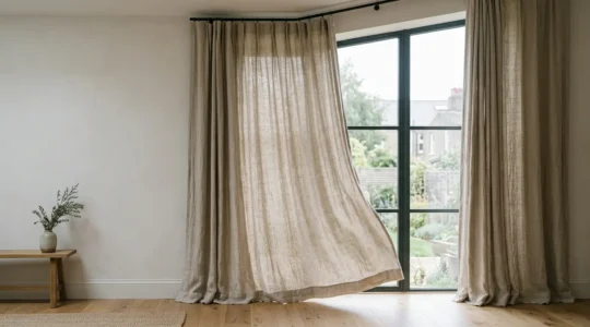
Incorporating Natural Linen Textiles
Linen brings organic texture, breathability and understated luxury to curtains, cushions, upholstery and bedding. Yet its reputation for wrinkling and shrinking deters homeowners who misunderstand the fibre’s unique properties and care requirements.
Choosing Weights and Origins
Linen comes in weights from gauzy 120 gsm (grams per square metre) suitable for sheer curtains, to robust 400+ gsm used for upholstery and heavyweight bedding. Lightweight linen (120 to 200 gsm) drapes beautifully for curtains but wrinkles conspicuously and lacks privacy. Medium-weight (200 to 300 gsm) suits cushion covers, light upholstery and summer bedding. Heavyweight (300+ gsm) provides structure for sofas, armchairs and winter bedding that feels substantial and cosy.
Belgian linen historically commanded premium prices due to superior flax-growing conditions and traditional processing methods that produce long, fine fibres. Chinese flax, meanwhile, offers affordability but quality varies widely between manufacturers. Look for certifications (European Flax or Masters of Linen labels) that verify origin and processing standards. In practice, high-quality linen from any origin outlasts cheap alternatives by decades.
Care Strategies That Preserve Quality
The primary linen pitfall: hot washing. Linen shrinks 8 to 10% when washed above 40°C for the first time, and the shrinkage is permanent. Always pre-wash linen curtains and covers in cool water before hemming or installation, tumble-dry on low or air-dry, then cut to final dimensions. Subsequent washes cause minimal additional shrinkage if you maintain cool temperatures.
Accept linen’s inherent texture rather than fighting it. The fabric’s casual drape and natural creasing are part of its appeal—attempting to maintain crisp, ironed linen curtains or bedding creates endless labour. If you prefer structure, choose medium to heavyweight linen blends (linen-cotton or linen-viscose) that resist wrinkling while retaining linen’s breathability and visual softness. Pure linen rewards those who embrace its relaxed, lived-in aesthetic.
Art and accessories represent the final, essential layer that transforms decorated rooms into personal spaces. Mastering the fundamentals—understanding materials, respecting scale, planning installation carefully and maintaining pieces appropriately—ensures that rugs, wall art, pottery, lighting and textiles deliver both beauty and performance across years of daily life. Each category presents distinct challenges, but the underlying principle remains constant: informed choices made with patience and attention to detail always outperform impulsive purchases driven by trends or convenience.
How to Keep Linen Furnishings Looking Crisp Without Constant Ironing
The belief that crisp linen requires constant ironing is a myth; the real secret is working with the fabric’s natural properties, not against them. Linen’s structure naturally regulates temperature and can be de-wrinkled with strategic use of steam and moisture….
Lire la suite
How to Position a Brass Mirror to Double Natural Light in a Dark UK Hallway?
The secret to doubling light in a dark UK hallway isn’t placing a mirror opposite a window; it’s mastering the ‘secondary bounce’ to turn your walls into light sources. Angle the mirror to reflect borrowed light onto a plain, light-coloured…
Lire la suite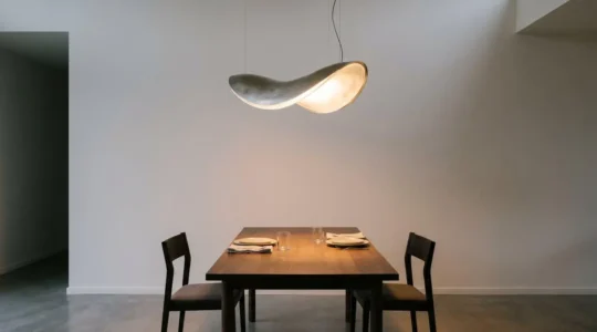
How to Choose a Sculptural Pendant That Lights a Room Properly, Not Just Looks Good
The common belief is that a statement pendant’s job is to look beautiful. The reality is that its primary role is to be a high-performance ‘light engine’ that sculpts the atmosphere of your room. A fixture’s material (opaque vs. translucent)…
Lire la suite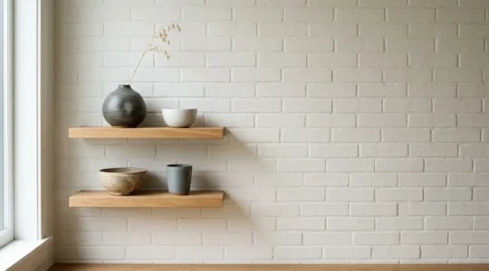
How to Style Hand-Thrown Pottery Without Making Your Home Look Like a Gift Shop
Transforming a pottery collection from clutter to a curated display isn’t about arrangement, but about understanding the interplay of light, form, and story. Matte glazes absorb light, creating calm, while shiny glazes reflect it, adding energy. Use this to set…
Lire la suite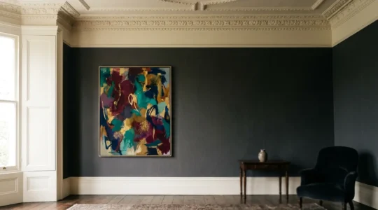
How to Hang an Abstract Painting in a Period Home Without It Looking Out of Place?
The greatest misconception is that modern art in a period home must create a stark, jarring contrast; the reality is that the most successful interiors create a sophisticated dialogue between eras. Success lies not in contrast, but in finding shared…
Lire la suite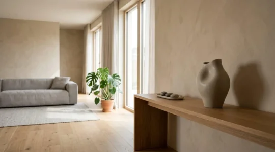
How to Choose a Single Decorative Object That Defines Your Entire Living Room?
The power of a room lies not in the quantity of its objects, but in the narrative quality of a single, well-chosen hero piece. Prioritize an object’s ‘visual weight’ and material story over its mere size or color. Choose artisan-made,…
Lire la suite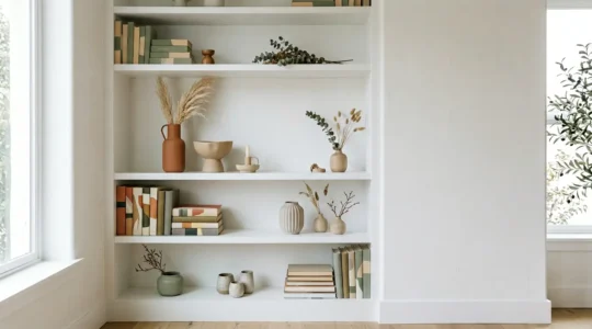
How to curate a shelf display that looks intentional, not cluttered
The frustration of a cluttered shelf full of randomly assembled accessories stems from a lack of a unifying story. The solution isn’t about buying more matching items, but about acting as a curator for your own life. This guide moves…
Lire la suite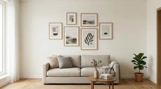
How to Hang a Gallery Wall in a Rented Flat Without Losing Your Deposit?
Hanging a gallery wall in a rental isn’t about hope; it’s about engineering. The key to protecting your deposit is to understand the physics of failure and proactively mitigate risk. Most damage-free strips fail not from weight, but from incorrect…
Lire la suite
How to Choose a Rug That Survives Kids, Dogs and a Muddy UK Winter?
The secret to a family-proof rug isn’t finding an indestructible material, but choosing one that ages gracefully by understanding its core properties. Fibre science, not just the material name, dictates how a rug handles spills, moisture, and wear. Construction quality…
Lire la suite