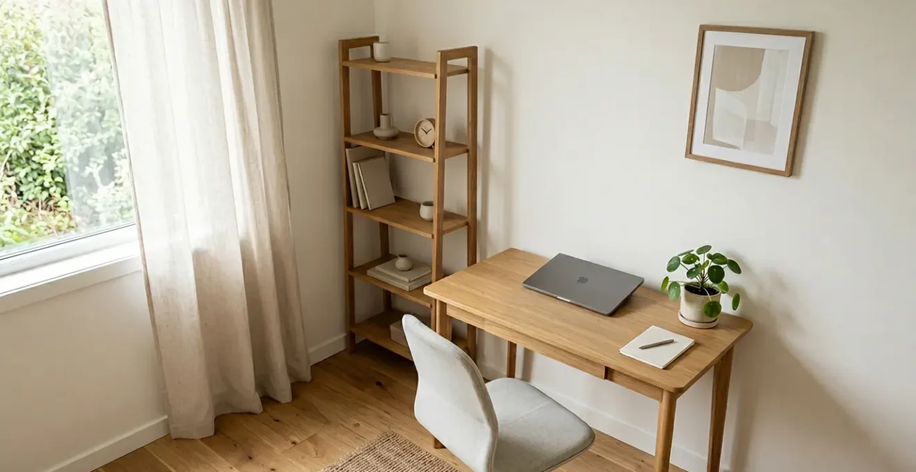
Tired of your spare room feeling like a chaotic compromise between a guest space and a functional office? The secret isn’t just buying multi-functional furniture; it’s about intentional design. This guide moves beyond generic tips to show you how to use professional zoning, lighting, and material strategies to create a dedicated, ergonomic workspace that feels completely integrated with your home’s style, solving the specific challenges of a typical UK semi-detached house.
That 12-square-metre spare room. For so many of us working remotely in the UK, it has become the hardest-working space in the house, tasked with being a professional hub by day, a peaceful guest room by night, and a storage space for everything in between. The common advice is to throw in a desk and some shelves, but this often leads to a space that feels like a permanent, cluttered compromise. You’re left with an ergonomic chair that clashes with the curtains and a workspace that never quite lets you switch off.
You’ve probably already tried decluttering or searching for that one magic piece of ‘convertible’ furniture. But what if the real solution isn’t about cramming more functions into the room, but about defining them with clarity and style? What if the key to a successful dual-purpose room wasn’t sacrificing aesthetics for function, but using design principles to make them work together? This is where we move beyond simple furniture selection and into the realm of aesthetic integration.
This guide is built on a single, powerful principle: a truly effective home office is not a functional island parachuted into a room, but a seamlessly integrated zone that enhances, rather than disrupts, the room’s character. It borrows its style from your home’s existing story. Forget the sterile office look; we’re creating a space that is both a high-performance work zone and a beautiful, cohesive part of your home.
Through this article, we will explore the core challenges faced in typical UK homes, from chaotic open-plan areas to awkward period features. We will provide practical, expert-led solutions for everything from lighting and flooring to mastering the art of phased renovation, ensuring your home works for you, beautifully and efficiently.
Summary: Designing Your Integrated UK Home Office
- Why Does Your Open-Plan Kitchen-Diner Always Feel Chaotic Despite Decluttering?
- How to Layer Lighting in One Room That Serves as Lounge, Office and Dining Area?
- Engineered Oak or LVT: Which Flooring Survives a Rainy UK Hallway Best?
- The Sofa-Sizing Mistake That Blocks 40% of UK Living Room Doorways
- How to Renovate Room by Room Over 18 Months Without a Disjointed Result?
- Why Do Flat-Pack Wardrobes Never Fit Your 1920s Bay-Window Bedroom?
- How to Create One-Touch Lighting Scenes for Work, Dinner and Movie Night?
- How to Commission a Custom Built-In Wardrobe for Under £3,000 in the UK?
Why Does Your Open-Plan Kitchen-Diner Always Feel Chaotic Despite Decluttering?
The core issue in most open-plan living spaces isn’t the amount of ‘stuff’; it’s the lack of clear boundaries. When your dining table is also your desk and inches away from the kids’ play area, your brain perceives it as one large, muddled zone. This constant visual noise is mentally draining and is why you can tidy for an hour, only for it to feel chaotic again moments later. The solution lies in a design concept known as zone demarcation, which is about creating distinct visual and functional ‘areas’ without building walls.
Think of it like a stage set. Each area has its purpose, defined by subtle cues. A large, plush rug might define the ‘lounge zone’, its edges creating an invisible boundary. A row of pendant lights hanging low over the dining table designates the ‘eating zone’. The ‘work zone’ could be a nook painted in a slightly deeper shade than the main walls, creating a sense of enclosure. These aren’t physical barriers, but powerful psychological signals that help your brain categorise the space and bring a sense of order.
This principle is fundamental to creating a calm, multi-use environment. As the editorial team at Homes & Gardens expertly puts it in their guide to harmonious living spaces:
Kitchen zoning is all about creating dedicated areas for every use of the space.
– Homes & Gardens Editorial Team, Kitchen Zoning Article 2026
By applying this thinking, you can start to reclaim your open-plan area. It’s not about having less; it’s about giving everything a clear and intentional ‘home’. A well-defined space allows you to mentally ‘leave’ your work desk, even if it’s just two metres from your sofa, because you are crossing a psychological, design-defined threshold.
Once you embrace zoning, the next logical step is to use the most powerful tool at your disposal to define those zones: light.
How to Layer Lighting in One Room That Serves as Lounge, Office and Dining Area?
Lighting is the single most effective tool for transforming a single room into a multi-functional powerhouse. The wrong lighting—often a single, harsh overhead fixture—flattens the space and creates a one-size-fits-all environment that is perfect for nothing. The right approach is layered lighting, a three-part strategy that allows you to define zones and change the room’s entire mood at the flick of a switch.
The three essential layers are:
- Ambient Light: This is the general, overall illumination of the room. Think recessed spotlights, a central ceiling fixture, or light bouncing off walls. It sets the base level of brightness.
- Task Light: This is focused, functional light for specific activities. It’s the bright, clear light from a desk lamp for working, under-cabinet strips for food prep, or a reading lamp by a chair.
- Accent Light: This is the ‘mood’ layer. It adds depth and character. Think of a stylish floor lamp washing a corner in a warm glow, picture lights highlighting art, or smart LED strips behind a TV.
For your multi-use room, this means you can create different atmospheres for different activities. During the workday, you’ll have the ambient light on, plus a powerful task light on your desk. When it’s time for dinner, you turn the desk light off and switch on a warm, low-hanging accent pendant over the table. For a cosy movie night, you might turn off almost everything, relying only on a couple of low-level accent lamps. This layering is what creates true visual separation and flexibility.
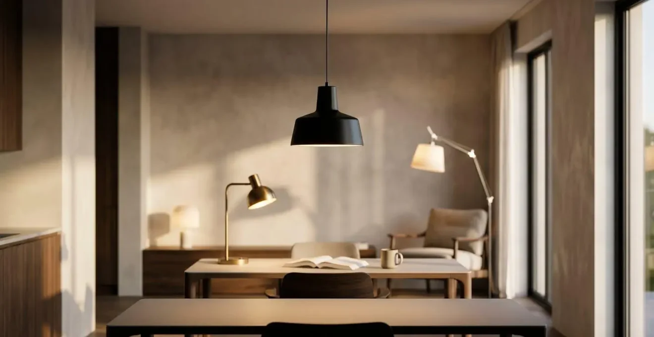
As you can see in this example, each light source carves out its own distinct area. The desk lamp creates a focused bubble of concentration, the pendant defines the social dining spot, and the floor lamp creates a soft, relaxing corner. By combining these, you can instantly shift the room’s primary function without moving a single piece of furniture.
This same principle of using materials to define function applies right down to the floor beneath your feet.
Engineered Oak or LVT: Which Flooring Survives a Rainy UK Hallway Best?
Your flooring is the fifth wall of your home and a powerful tool for zoning, especially in high-traffic areas like a UK hallway that has to contend with rain, mud, and constant footfall. The choice between the natural beauty of Engineered Oak and the robust practicality of LVT (Luxury Vinyl Tile) is a common dilemma. While oak offers timeless warmth, its performance in a damp environment can be a concern. LVT, on the other hand, is built for durability but has historically been seen as a compromise on authenticity. Today, the lines are much more blurred.
Engineered Oak is constructed with a real wood top layer, giving you the authentic look and feel of solid wood, but with a more stable core that is less prone to warping. It’s warmer underfoot and offers good natural insulation. However, it is only water-resistant, not waterproof. Puddles from a wet coat or muddy boots left unattended can lead to staining or damage over time. LVT is a high-tech composite material that is 100% waterproof, making it an incredibly resilient choice for entranceways. Modern high-definition printing technology also means it can mimic the look of wood with surprising realism.
The decision ultimately comes down to balancing your priorities between authenticity, maintenance, and performance in the specific conditions of a UK home. This comparison, drawing on insights from flooring specialists, breaks down the key differences.
| Feature | Engineered Oak | LVT (Luxury Vinyl Tile) |
|---|---|---|
| Water Resistance | Moderate – tolerates spills if cleaned quickly | Fully waterproof – ideal for wet areas |
| Acoustic Performance | Warmer underfoot, naturally insulates better | Can feel cooler but offers excellent sound insulation with proper underlay |
| Thermal Comfort | Naturally warm feeling, superior insulation | Cooler surface but compatible with underfloor heating |
| Longevity | 20+ years if maintained, can be sanded and refinished | 10-20 years, cannot be refinished |
| Authenticity | Real wood surface with natural grain variations | Printed surface mimicking wood, consistent pattern |
| Maintenance | Requires specialist cleaners and moisture control | Easy sweep and damp mop, no sealing needed |
As this detailed performance comparison shows, there’s no single ‘best’ option, only the best option for your lifestyle. For a busy family with pets and kids, the peace of mind from a waterproof LVT might outweigh the natural charm of wood. For a quieter household, the ability to sand and refinish oak for decades of use could be the deciding factor.
Of course, before the flooring goes down, you have to get the furniture in—a task that’s often harder than it looks.
The Sofa-Sizing Mistake That Blocks 40% of UK Living Room Doorways
There is no greater home renovation heartbreak than the sight of a beautiful new sofa stuck in your doorway. It’s a surprisingly common issue in the UK, where period properties often feature narrower-than-modern doorways and awkward hallway turns. While the title’s « 40% » might be an exaggeration for effect, the reality is still costly; 12% of UK home deliveries resulted in failed attempts due to access issues. Falling in love with a sofa’s style is the easy part; ensuring it can actually enter your living room requires a moment of cold, hard calculation.
Most people measure the width of their door and the width of the sofa. This is the first mistake. The critical measurement is often the sofa’s diagonal depth, which must be less than the doorway’s opening height, or its diagonal clearance. You also need to account for the entire journey, including tight corners in hallways or stairwells. Forgetting to measure a low-hanging light fixture or a radiator is a classic error.
Before you even click « buy », you need to perform a delivery audit. This isn’t just about measuring; it’s about visualising the path and understanding the geometry of the pivot. The process can feel daunting, but breaking it down into a clear checklist transforms it from guesswork into a simple, reassuring process.
Your Pre-Purchase Sofa Delivery Audit
- Measure Your Access Route: Note down the width and height of all doorways, hallways, and stairwells the sofa must pass through. Don’t forget to account for fixed obstacles like radiators or handrails.
- Measure the Sofa’s Critical Dimensions: You need three key numbers from the product page: the overall height (H), the overall width (W), and the diagonal depth (DD). If the diagonal depth isn’t listed, you can estimate it from the frame depth and height.
- Calculate Doorway Clearance: The crucial number is the diagonal clearance of your narrowest doorway. You can use a simple formula: square the doorway’s width, square its height, add them together, then find the square root of that sum.
- Compare Sofa to Clearance: Compare the sofa’s diagonal depth (DD) to the doorway’s clearance number you just calculated. If the sofa’s dimension is smaller, it should be able to pivot through the opening.
- Factor in a Safety Margin: Always allow for a minimum of 2cm of clearance on all sides for safe maneuvering and to avoid scraping walls or the furniture itself. If it’s going to be tighter than this, reconsider the purchase.
Once your key furniture is in place, you can turn your attention to building a cohesive look across the entire home, even when renovating one piece at a time.
How to Renovate Room by Room Over 18 Months Without a Disjointed Result?
Most of us don’t have the budget or stamina to renovate an entire house in one go. The reality for many in the UK is a phased, room-by-room approach, often spread over months or even years. The biggest danger of this process is « design drift »—what looked great in 2024 might clash horribly with the choices you make in 2026, leading to a home that feels like a collection of disconnected projects rather than a unified whole.
The solution is to think like a professional designer and create a master material palette before you buy a single tin of paint. This isn’t a rigid, prescriptive document, but a guiding framework for your entire home. It’s a physical or digital collection of the core materials, colours, and finishes that will define your home’s character. This palette becomes your North Star for every decision you make, from wall colours to door handles to flooring choices.
Your master palette should include:
- Flooring: The type and finish of the main flooring (e.g., warm engineered oak, dark slate LVT).
- Key Colours: A limited palette of 3-5 core colours—a neutral base, a supporting shade, and one or two accent colours.
- Wood Tones: The primary wood finish for furniture or joinery (e.g., light ash, rich walnut).
- Metal Finishes: The consistent finish for hardware like taps, handles, and light fittings (e.g., brushed brass, matt black).
- Key Textiles: The textures that will bring softness and warmth, such as linen, velvet, or wool.
This curated collection ensures that even if you renovate the living room this year and the bedroom in two years, the underlying design DNA remains consistent. The metal finish on your new kitchen taps will complement the light fittings you choose for the hallway later on. This is the secret to achieving long-term cohesion.
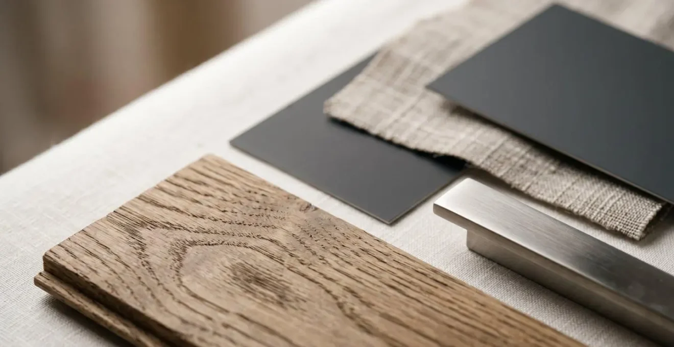
By gathering samples and creating this physical mood board, you can see how the elements interact and make informed choices. It allows you to introduce variety (a bold accent colour in the office, for example) while ensuring it works within the overall harmonious scheme.
This planning is especially critical when dealing with the unique challenges of older UK housing stock.
Why Do Flat-Pack Wardrobes Never Fit Your 1920s Bay-Window Bedroom?
It’s a scenario familiar to anyone living in a period property: you spend a weekend assembling a flat-pack wardrobe, only to find it won’t sit flush against the wall. There’s an awkward gap at the top, it rocks on the uneven floor, and the skirting board is holding it 10cm away from the wall. The reason is simple: flat-pack furniture is designed for a perfect world of straight lines and 90-degree angles. Your 1920s house is not that world.
Period properties, especially the beloved semi-detached houses from the 1920s and 30s, are full of character and, from a furniture perspective, imperfections. Walls are rarely perfectly plumb (vertical), floors are often not level, and features like deep skirting boards, picture rails, and chimney breast alcoves are standard. Flat-pack furniture, manufactured with precise, rigid geometry, cannot adapt to these charming irregularities.
The most common issues you’ll encounter are:
- Uneven Walls & Floors: A wardrobe needs a flat surface to be stable. On an old, slightly bowed floor, it will rock, putting stress on its joints.
- Skirting Boards: Standard flat-pack designs don’t have a recess at the back to accommodate deep, ornate skirting boards, creating an unavoidable gap.
- Non-Standard Alcoves: The alcoves on either side of a chimney breast are prime spots for storage, but they are never a standard width. An off-the-shelf wardrobe will either not fit or will leave wasted, awkward gaps on either side.
- Bay Windows: The angled walls of a bay window create a beautiful feature but are impossible to furnish with rectangular, flat-pack units without sacrificing a significant amount of space and style.
This fundamental mismatch between modern manufacturing and historic construction is why off-the-shelf solutions often look cheap and ill-fitting in a period home. It’s not a failure on your part; it’s a failure of the product to meet the reality of the architecture. This is where thinking about bespoke or semi-bespoke solutions becomes less of a luxury and more of a practical necessity for a truly polished result.
Just as custom storage can solve physical space issues, custom lighting scenes can solve the challenge of a room’s changing moods.
How to Create One-Touch Lighting Scenes for Work, Dinner and Movie Night?
Once you’ve layered your physical lights (ambient, task, accent), the next level of control and convenience comes from smart lighting. This technology allows you to group different lights and save their settings as ‘scenes’ that you can recall with a single tap on your phone, a voice command, or a physical smart button. This is how you truly unlock the potential of a multi-use room, transforming its entire atmosphere in an instant.
The key is to program scenes based on an ’emotional palette’, using light colour and intensity to support the desired activity. Light temperature, measured in Kelvin (K), is crucial here. Cooler, blue-toned light (4000K-5000K) mimics daylight and promotes alertness, making it ideal for work. Warmer, yellow-amber light (2200K-3000K) is similar to candlelight or firelight, which our brains associate with relaxation and socialising.
Here is a practical guide to programming three essential scenes for a living/dining/work space:
- Focus Scene (Work Mode): Set your main task light (your desk lamp) and ambient overhead lights to a cool 4000K-5000K temperature at around 80% brightness. This blue-enriched light is proven to help with concentration. Keep accent lights off to minimise distractions.
- Social Scene (Dinner Mode): Switch to a warmer, more inviting atmosphere. Dim the main ambient lights and turn on the accent lights over the dining table. Set them to a neutral warm 3000K at about 60% brightness to create a comfortable, flattering glow.
- Relax Scene (Movie Night): Create an intimate, cosy mood. Turn off all main overhead lighting. Use only a few accent lights, such as floor lamps or table lamps, set to a very warm 2200K-2700K and dimmed to just 20% brightness. This minimises screen glare and encourages relaxation.
To make this seamless, configure a slow 5-15 minute crossfade between scenes to avoid jarring shifts in light. Crucially, don’t rely solely on an app. Install a physical smart switch or NFC tags in logical locations so that anyone in the household can intuitively switch between ‘Work’, ‘Dinner’, and ‘Relax’ mode without needing a phone.
With your lighting perfected, the final piece of the puzzle for a truly integrated and stylish room is often finding a storage solution that fits perfectly.
Key takeaways
- Zone with Purpose: Use rugs, paint, and furniture placement to create clear, functional zones within a single room to reduce visual chaos.
- Layer Your Lighting: Combine ambient, task, and accent lighting to instantly change a room’s mood and function, from a focused workspace to a relaxing lounge.
- Plan for Cohesion: Create a master material palette of colours, woods, and metals before you start, ensuring a unified look even when renovating room by room over time.
How to Commission a Custom Built-In Wardrobe for Under £3,000 in the UK?
The ultimate solution to the storage challenges of a period property is the built-in wardrobe. It maximises every inch of space, hides clutter, and can be designed to perfectly match your home’s character. However, the word ‘commissioned’ or ‘bespoke’ often comes with a terrifying price tag. While a fully bespoke, handcrafted wardrobe from a high-end joiner can easily exceed £5,000-£10,000, there is a clever, industry-insider strategy to achieve a premium, custom look for under £3,000.
This approach is a hybrid model that combines the affordability and modularity of mass-produced carcasses with the high-end finish of custom-made doors and trim. It’s about being strategic with your budget, spending money on what you see and saving it on what you don’t. This allows you to get that flawless, wall-to-wall, floor-to-ceiling look without the full bespoke cost.
Here is a breakdown of a proven strategy used by UK interior designers to achieve this balance:
The IKEA PAX Hybrid Strategy
This popular approach uses the affordable and highly versatile IKEA PAX wardrobe system as the internal structure. These carcasses are robust, come in various sizes, and have a huge range of internal fittings. You spend the bulk of your budget not on the structure, but on the visible elements. You hire a local joiner or use a specialist online company to create custom doors, end panels, and plinths to fit the PAX frames. By adding cornice at the top and scribe panels to the sides, the joiner can seamlessly blend the unit into the walls, accommodating any slopes or unevenness. The final touch is to invest in high-quality handles. The result is a wardrobe that looks entirely bespoke, as the affordable IKEA core is completely hidden behind a beautiful, custom-made facade.
This strategy cleverly focuses your spending on the parts that deliver the most aesthetic impact. The engineered core of the PAX system provides stability and functionality, while the custom doors and trim provide the luxury, character, and perfect fit that off-the-shelf solutions can never offer. It’s the single most effective way to get a truly integrated, high-end storage solution on a realistic budget in the UK.
Now that you have a framework for zoning, lighting, and storage, your first practical step is to start defining your home’s unique style by creating the master material palette we discussed. This is your foundation for a truly cohesive and beautiful home.