The greatest misconception is that modern art in a period home must create a stark, jarring contrast; the reality is that the most successful interiors create a sophisticated dialogue between eras.
- Success lies not in contrast, but in finding shared principles of colour, scale, and form that bridge the old and the new.
- Technical details like frame choice, hanging height relative to furniture, and even wall paint finish are the tools that create this conversation.
Recommendation: Stop trying to make your art ‘pop’ with contrast and start looking for ways to make it ‘talk’ to your architecture through considered, harmonious choices.
You stand back, admiring the elegant proportions of your Georgian drawing-room or the intricate cornicing in your Victorian hallway. In your hands, a bold, vibrant abstract painting pulses with contemporary energy. The two things you love most feel worlds apart, and the fear of combining them is real. Will it look jarring? Will it devalue the history of the space? Will it simply look… wrong? This hesitation is the single biggest barrier for homeowners looking to express their modern taste within a historically rich setting.
Common advice often falls into simplistic traps: « just create a bold contrast » or « use a simple black frame. » While not entirely wrong, these platitudes miss the point. They treat the artwork as an intruder and the architecture as a backdrop. This approach ignores the opportunity for a much richer, more intentional relationship between the two. The true art of placement isn’t about forcing two styles together; it’s about finding a common language so they can speak to one another.
But what if the key wasn’t about contrast at all, but about creating an architectural dialogue? This is the core principle that separates an amateur placement from a professional, curated interior. It’s a perspective shift that reframes the challenge: your goal is not to decorate a wall, but to orchestrate a conversation between the history of your home and the story of your art. This requires moving beyond surface-level tips and understanding the subtle mechanics of visual harmony.
This guide will deconstruct that professional methodology. We will move from foundational colour theory and framing techniques to the often-misunderstood principles of scale and placement. By the end, you will have the confidence to not just hang a painting, but to integrate it, creating a space that feels both timeless and personally expressive.
To guide you through this process, we’ve structured this article to address the key decisions and challenges you’ll face. The following sections break down the art consultant’s approach into actionable steps, from broad colour choices to the fine details of finish and form.
Contents: A Guide to Harmonising Art and Architecture
- Why Should You Pull Your Cushion Colours From Your Abstract Painting?
- How to Frame a Bold Abstract Canvas to Suit Ornate Victorian Mouldings?
- Gallery Wrap or Framed Edge: Which Presentation Suits a Minimalist UK Lounge?
- The Eye-Level Myth That Makes 60% of UK Homeowners Hang Art Too High
- When Do London Galleries Offer Emerging-Artist Works at Accessible Prices?
- Matte, Eggshell or Satin: Which Finish Makes Cornicing Pop in a North-Facing Room?
- Why Does Your Large Sculpture Overwhelm the Console While Your Small Vase Disappears?
- How to Choose a Single Decorative Object That Defines Your Entire Living Room?
Why Should You Pull Your Cushion Colours From Your Abstract Painting?
The idea of matching your cushions to your art can feel prescriptive, but it’s the most effective way to initiate the « architectural dialogue » we’re aiming for. It’s not about a perfect, soulless match; it’s about creating colour echoes that weave the artwork into the fabric of the room. When a secondary or tertiary colour from your painting reappears in a textile—be it a cushion, a throw, or a rug—you are subconsciously telling the eye that these two disparate objects belong in the same story. This repetition creates a sense of intention and cohesion.
Instead of pulling the most dominant colour, which can feel heavy-handed, focus on the more subtle, unexpected hues within the artwork. Is there a sliver of ochre in a predominantly blue canvas? A hint of deep plum in a sea of pastels? These are the colours that, when repeated in the room, create a sophisticated and layered palette. The artwork becomes the anchor of your colour scheme, grounding your choices with an authoritative reference point.
Case Study: Cohesion Through Colour Repetition
In designing a bedroom around a central piece of abstract art, the most successful integrations occur when the art’s colours are echoed in existing textiles. For example, pulling a specific shade of teal from a canvas and finding it in the pattern of the curtains or bedding creates an immediate visual link. This strategy of repetition makes the artwork feel like an integral part of the room’s design from the outset, rather than a late addition. Aligning the colour temperature—warm or cool tones—between the art and the room’s fixtures further solidifies this sense of harmony.
This technique transforms the painting from a standalone object into an active participant in the room’s design. It’s a simple, powerful way to ensure your bold contemporary piece doesn’t feel like an afterthought in your traditional home. It feels considered, curated, and completely at home.
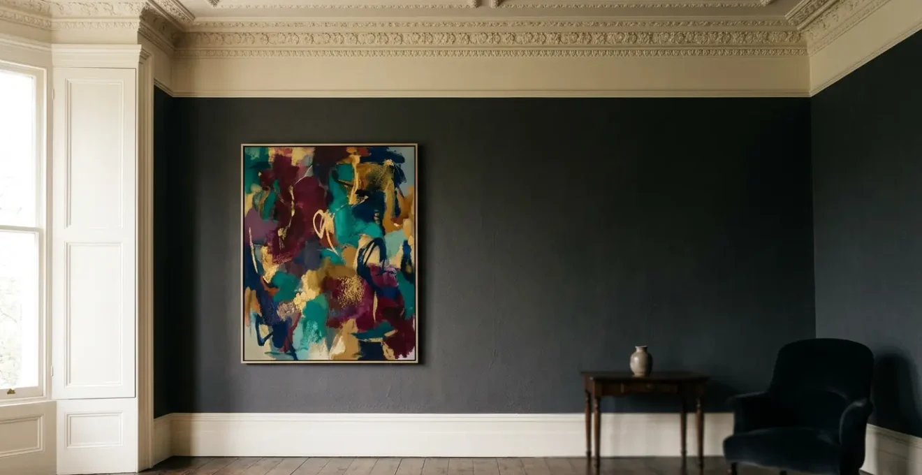
How to Frame a Bold Abstract Canvas to Suit Ornate Victorian Mouldings?
The frame is the most critical element in bridging the gap between a contemporary artwork and a period interior. It acts as a translator, mediating the conversation between the clean lines of the modern piece and the ornate details of the architecture. As one design consultant notes, it’s about finding a balance between respecting the past and embracing the present.
If the room shouts Victorian, have the space speak with art that is current, colorful, tasteful, and modern with movement and rhythm. While cubism brings a fresh approach to a Victorian space, abstract paintings have the power to successfully blend old and new.
– Barry Lantz, A Lantz Design and Consulting, featured in Meural Editorial
A common mistake is to choose a frame that is either too modern (a thin black profile that creates a harsh separation) or too traditional (an ornate gold frame that competes with the art). The most effective solution is often a « bridge » frame that incorporates elements of both. Consider a « floater » frame, where the canvas appears to hover within the frame, but with a profile that has a touch of warmth or traditional form. A simple, solid wood frame with a hand-applied finish or a slim metal frame in a soft, brushed brass can speak to both the modern artwork and the aged patina of a period setting.
This careful choice of framing creates a deliberate and visible dialogue at the intersection of old and new, allowing both the artwork and the architecture to be appreciated for their unique qualities.

As you can see, the meeting point between the two styles becomes a point of interest, not of conflict. The key is to select a frame that acknowledges the character of the room without overwhelming the artwork itself. Think of it not as a border, but as a piece of diplomacy, elegantly negotiating the relationship between two distinct eras.
Gallery Wrap or Framed Edge: Which Presentation Suits a Minimalist UK Lounge?
For those leaning towards a more minimalist aesthetic within their period home, the choice between a gallery-wrapped canvas and a traditional framed edge is pivotal. A gallery wrap, where the canvas is stretched over the stretcher bars with the image continuing around the sides, offers a clean, object-like presence. It allows the artwork to exist as a pure form, free from the visual interruption of a frame. This can be particularly effective for large, immersive abstract pieces where the colour and texture are meant to command the space entirely.
Conversely, a framed edge, even a very minimal one, provides a sense of finish and containment. It delineates the artwork from the wall, adding a layer of refinement and intentionality. In a UK lounge where period features like dado rails or textured wallpaper are present, a slim frame can provide a necessary « buffer, » preventing the modern art from feeling abrupt against the historical backdrop. The decision hinges on whether you want the art to feel like a seamless, modern intervention or a considered, curated object placed within a historic context. The following comparison, based on an analysis of presentation styles, can help guide your choice.
| Feature | Gallery Wrapped Canvas | Framed Canvas |
|---|---|---|
| Aesthetic | Modern, frameless, art-forward | Refined, gallery-ready, sophisticated |
| Best For | Casual spaces, minimalist interiors | Formal settings, traditional interiors |
| Weight | Lightweight, easy to hang | Heavier, requires sturdy hardware |
| Cost | More budget-friendly | Higher cost due to frame materials |
| Protection | Edges exposed, less protective | Frame provides edge protection |
| Visual Impact | Focus entirely on image | Frame adds refinement layer |
Ultimately, in a minimalist UK lounge within a period home, the gallery wrap often works best when the walls are simple and serve as a quiet, neutral background. If the room retains strong architectural character, a discreet floater frame is typically the superior choice, providing a subtle but important transition that respects both the art and the space it inhabies.
The Eye-Level Myth That Makes 60% of UK Homeowners Hang Art Too High
One of the most persistent and misleading rules in interior design is to « hang art at eye level. » This simple advice is the culprit behind countless visual disconnects in homes, because « eye level » is subjective and often interpreted from a standing position. As professional interior designers frequently point out, this almost always results in art being hung too high, making it feel like it’s floating away from the furniture and disconnected from the human scale of the room. A staggering number of homeowners, estimated around 60% in the UK, fall into this trap.
The correct approach is not about your standing height, but about the artwork’s relationship to the room’s composition. The professional standard is to hang a piece so its vertical centre is between 57 and 60 inches from the floor. This range represents the average human eye level and is the standard used by galleries and museums. More importantly, when hanging art above furniture like a sofa, console, or fireplace mantel, the bottom of the frame should be just 6 to 8 inches above the furniture’s surface. This creates a cohesive visual unit, or what designers call the « anchoring principle. » The art and furniture become a single vignette, grounded and intentional.

In living rooms or dining rooms, where you spend most of your time seated, it’s even more crucial to consider the seated eye level. Hanging the art slightly lower, towards the 57-inch mark, ensures it feels part of your intimate space when you’re relaxed, rather than looming above you. This simple adjustment from an abstract rule to a relational principle can transform the entire feel of a room.
Action Plan: Auditing Your Current Art Placement
- Identify Contact Points: List all the artworks currently hanging in your main living areas. Note what furniture (if any) each piece is positioned above.
- Collect Data: Use a tape measure. For each piece, measure the distance from the floor to the centre of the artwork, and the distance from the bottom of the frame to the top of the furniture below it.
- Check for Cohesion: Compare your measurements to the professional guidelines: is the centre between 57-60 inches from the floor? Is the gap above furniture between 6-8 inches?
- Assess Emotional Impact: Sit on your sofa. Does the art feel connected to your seated experience, or is your gaze pulled uncomfortably upward? Note which pieces feel « floating » versus « anchored ».
- Create an Action Plan: For artworks that are too high, prioritise re-hanging them according to the 6-8 inch rule above furniture. This single change will have the most dramatic impact.
When Do London Galleries Offer Emerging-Artist Works at Accessible Prices?
Building a meaningful art collection for your period home doesn’t have to mean breaking the bank. The key is strategic timing and knowing where to look, especially within the vibrant London art scene. Acquiring work from emerging artists not only offers more accessible price points but also allows you to invest in the next generation of talent. Certain times of the year are particularly fruitful for discovering high-quality, affordable contemporary art.
By targeting specific events and venues, you can bypass the premium prices of established gallery solo shows and find pieces that are perfectly suited to your space and budget. This proactive approach turns art buying from a daunting expense into an exciting hunt for hidden gems. Here are the key moments in the London art calendar to mark for acquiring affordable pieces:
- Graduate Shows (June-July): Events at the Royal College of Art (RCA) and Slade School of Fine Art are treasure troves. Final-year students showcase their work, often unframed, which presents an opportunity to invest the savings into a custom « bridge » frame that perfectly suits your interior.
- Open House London & Studio Weekends (September): Artist-dense areas like Deptford, Hackney Wick, and Peckham open their studio doors. This gives you direct access to artists, allowing you to discuss their work and even commission a piece with the specific dimensions and colour palette of your period home in mind.
- The Affordable Art Fair (March & October): Held in Battersea, this fair is designed for accessibility, with a price ceiling (often around £6,000). It’s an efficient way to see a huge variety of artists and styles in one place. Come prepared with photos of your rooms and wall dimensions to find a solution for a specific « problem wall. »
- Art Fair Advantage: Unlike a solo show where an artist presents a cohesive but potentially large-scale body of work, fairs allow you to compare multiple artists, sizes, and price points, making them ideal for a targeted design mission.
Visiting gallery solo shows is still valuable for discovering an artist’s complete vision, but these often feature larger, higher-priced works. For acquisitions, focusing on these key events provides the best combination of quality, price, and choice.
Matte, Eggshell or Satin: Which Finish Makes Cornicing Pop in a North-Facing Room?
The choice of paint finish for your walls and architectural details is one of the most underrated tools in art placement, especially in the challenging lighting conditions of a north-facing room. These spaces receive cool, indirect light throughout the day, which can make colours appear flat and muted. While a matte finish is often praised for its ability to hide imperfections, it also absorbs light, which can deaden the room’s atmosphere. This is where a subtle shift in sheen can act as a powerful finish amplifier for both your architecture and your art.
In a north-facing room, using an eggshell or satin finish on your walls—not just the cornicing—is a transformative strategy. These finishes have a slight lustre that catches and gently reflects ambient light. This creates a soft, diffuse glow across the wall surface, preventing the space from feeling gloomy. The intricate details of Victorian or Georgian cornicing are picked out by this gentle sheen, giving them definition and presence without the harshness of a high-gloss paint.
This choice has a direct and beneficial impact on any artwork hung on that wall. The subtle luminosity created by an eggshell finish can act as a natural, built-in picture light, helping the artwork to stand out and feel more vibrant. This is a particularly effective technique for adding life to an abstract painting that relies on colour and texture for its impact.
In a dark, north-facing room, a wall in Eggshell (not just the cornice) can catch and reflect ambient light, creating a subtle ‘halo’ around a painting that helps it stand out without dedicated picture lighting.
– Interior Design Expert, Contemporary Victorian Interior Design Guide
By selecting a finish with a slight sheen, you are not just painting a wall; you are engineering the light in your room to enhance its historic features and give your contemporary art a luminous stage on which to perform.
Why Does Your Large Sculpture Overwhelm the Console While Your Small Vase Disappears?
This common decorating paradox is not about physical size, but about visual weight—a core concept in achieving balance. A large, airy wireframe sculpture might feel lighter and take up less visual space than a small, solid, dark ceramic vase. The latter has high visual density, drawing the eye and feeling « heavy, » while the former has low density. Understanding this principle is the key to successfully styling surfaces like console tables, mantels, and sideboards in your period home.
A single small object, no matter how beautiful, will often get lost against the grand scale of a period room’s architecture. It lacks the visual mass to hold its own. Conversely, an object that is physically large but not visually dense can overwhelm the surface it sits on. The secret to successful styling lies in creating balanced compositions that respect both the object and its environment. Here are the fundamental principles to follow:
- The Visual Density Concept: Always assess an object’s perceived weight over its physical size. A translucent glass piece feels lighter than an opaque stone one of the same dimensions. Choose objects whose visual weight is appropriate for the scale of the furniture they sit on.
- The Rule of Three: To give a small object presence, never leave it alone. Group it with two other items of varying heights and textures (e.g., a small vase, a stack of books, and a decorative tray) to create a single, more substantial composition.
- Negative Space is a Requirement: An object or a grouping should occupy no more than two-thirds of the surface’s width. This « breathing room » is essential for the eye to appreciate the form of the objects without the arrangement feeling cluttered.
- Relationship to Art Above: If you are placing objects below a painting, ensure they feel connected. The bottom of the artwork should be 6-10 inches above the furniture, and the decorative grouping should be scaled to occupy about 50-75% of the furniture’s width to maintain a balanced relationship.
By shifting your focus from « how big is it? » to « how heavy does it feel? », you can create vignettes that are balanced, sophisticated, and perfectly scaled to the unique character of your home.
Key Takeaways
- Dialogue Over Contrast: The most sophisticated interiors are built on a conversation between old and new, not a clash. Look for common ground in colour and form.
- The Anchoring Principle: Art must relate to the furniture beneath it. The 6-8 inch gap rule is more important than the generic « eye-level » myth.
- Visual Weight, Not Size: Judge decorative objects by their perceived heaviness, not their physical dimensions, to create balanced surface arrangements.
How to Choose a Single Decorative Object That Defines Your Entire Living Room?
In a room rich with architectural history and layered with contemporary art, a single, carefully chosen decorative object can serve as the ultimate defining statement. This object acts as a thematic bridge, a physical embodiment of the dialogue between the room’s past and its present. It’s not just another item on a shelf; it is the lynchpin that connects the traditional fireplace to the modern sofa, the period cornicing to the abstract canvas. Choosing this object is the final and most personal act of curation.
This « bridge » object often succeeds because it shares qualities with both the old and the new. It might be a mid-century ceramic lamp whose organic form echoes the curves in a Victorian ceiling rose, but whose clean finish speaks to modern sensibilities. It could be a sculptural piece of hand-blown glass whose colour is pulled directly from your abstract painting, but whose classical shape references a historic form. The power of this object lies in its ability to contain multitudes and tell a story of synthesis.

Case Study: The Gallery Wall as a Thematic Bridge
In a Modern Victorian interior project, designers faced the challenge of uniting a contemporary sofa with a traditional fireplace. Instead of a single object, they created a single curated display: a gallery wall. By mixing ornate, Victorian-style frames with modern art prints, vintage florals, and quirky abstract pieces, they created one cohesive element that served as the room’s defining feature. This single, multifaceted installation became the conversation-starting focal point, successfully bridging the disparate styles and unifying the entire living space.
To find your own defining object, look for pieces that possess this dual-natured quality. Consider material, form, and story. A piece with craftsmanship and a sense of history, but a clean, modern silhouette, is often a perfect candidate. This final, thoughtful touch is what elevates a decorated room into a truly personal and harmonised home.
Armed with these principles, you are now equipped to move beyond fear and uncertainty. The next step is to look at your own space with a fresh, confident eye and begin the exciting work of creating a home that reflects every facet of your taste. Start by auditing your current layout and identify one small change you can make today to begin the dialogue between your art and your home.