The key to a warm minimalist living room isn’t adding more ‘cosy’ items, but the soulfulness of what you choose to keep and how you honour the space around it.
- Warmth is created through a dialogue of textures (wood, linen, stone) and the strategic layering of soft, warm-toned light.
- True minimalism is not about emptiness, but about intentional curation where every object, from an armchair to a single vase, serves a purpose and tells a story.
Recommendation: Start by identifying one ’emotional anchor’ piece for your room and build the space’s feeling and function around it, subtracting everything that doesn’t support its role.
The dream of a minimalist living room is seductive: a calm, clutter-free sanctuary that quiets the mind. Yet, for many UK homeowners, the reality can be a space that feels less like a serene retreat and more like a sterile clinic. You’ve followed the advice—decluttered surfaces, chosen expensive, clean-lined furniture, and painted everything a shade of white—only to find yourself in a room that lacks a soul. The common solutions often miss the point, suggesting you simply add a throw blanket or a generic plant. These are mere accessories, not solutions.
What if the persistent coldness isn’t a problem of ‘not enough’ but a misunderstanding of the minimalist philosophy itself? True warmth in a pared-back space doesn’t come from layering on ‘cosy’ clutter. It emerges from a deeper, more intentional process. It’s found in the subtle interplay of light and shadow, the tactile conversation between different natural materials, and the courage to let a single, beautiful object command an empty corner. This is the art of warm minimalism: a celebration of restraint that makes every chosen element profoundly significant.
This guide moves beyond the platitudes. We won’t just tell you to ‘add texture’; we will explore how to make textures speak to one another. We won’t just say ‘declutter’; we will investigate the psychology of visual chaos and the precise moment a full overhaul becomes necessary. Prepare to rethink your approach and discover how to curate a living room that is not only minimalist but also deeply, authentically inviting.
To guide you through this refined approach, this article is structured to address the core mistakes and master the essential techniques of warm minimalism. The following sections will provide a clear roadmap to transforming your space from clinical to curated.
Summary: Crafting Your Warm and Inviting Minimalist Sanctuary
- Why Does Your All-White Room Feel Clinical Despite Expensive Furniture?
- How to Choose the One Armchair That Justifies an Otherwise Empty Corner?
- Warm White or Cool White Walls: Which Creates Calm in a North-Facing UK Room?
- The Cupboard Chaos Mistake That Undermines Your Minimalist Living Room
- When Is the Right Moment to Commit to a Full Minimalist Overhaul?
- The Feature-Overload Mistake That Makes Georgian Townhouses Feel Cluttered
- The Mantelpiece Overload Mistake That Makes Your Living Room Feel Busy
- How to Curate a Shelf Display That Looks Intentional, Not Cluttered?
Why Does Your All-White Room Feel Clinical Despite Expensive Furniture?
The all-white room is the quintessential image of minimalism, yet it’s notoriously difficult to execute without it feeling cold and impersonal. The primary culprit is often a one-dimensional approach to lighting. A single, harsh overhead light source casts flat shadows and bleaches out any nuance in your white walls and pale furniture, creating a laboratory-like atmosphere. Expensive furniture, no matter its quality, cannot single-handedly inject warmth into a poorly lit space. Warmth is not a product you buy; it’s an atmosphere you build, and light is your most crucial material.
To counteract the clinical feel, you must think of light in layers, each with a specific job. Ambient light provides the base-level glow, task light offers focused illumination for activities like reading, and accent light creates depth by highlighting texture and form. Using bulbs with a warm colour temperature (around 2700K) is non-negotiable. This mimics the gentle glow of candlelight or a fireplace, tones that are instinctively perceived as welcoming. Furthermore, installing dimmers is not a luxury but a necessity. The ability to lower the intensity of your lighting is the single most effective way to shift a room’s mood from functional and bright to intimate and restful.
A successful warm minimalist room uses light to ‘paint’ the space. Instead of flooding the room with uniform brightness, use pools of light to create zones of intimacy. A soft glow behind a plant, a wash of light across a textured wall, or a focused beam on a piece of art—these are the details that build a rich, complex visual experience. They create contrast, depth, and a sense of mystery that draws you in. The furniture becomes part of this illuminated landscape, its form and texture revealed by the careful play of light and shadow, finally allowing its inherent quality to shine through.
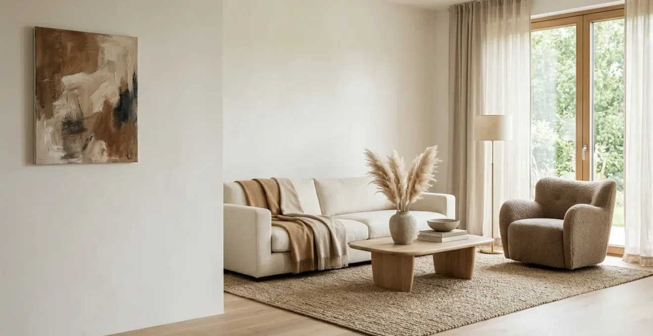
How to Choose the One Armchair That Justifies an Otherwise Empty Corner?
An empty corner in a minimalist living room is not a problem to be solved; it’s an opportunity for a powerful statement. Filling it with just any chair is a mistake. The goal is to find one piece that possesses enough presence and personality to command the space, transforming emptiness into intentional, ‘sculptural silence’. This is not about function alone; it’s about choosing an emotional anchor for the room. This single armchair must be more than a seat; it must be a piece of functional sculpture.
When selecting this pivotal piece, prioritise form and material over fleeting trends. Look for a chair with a strong, beautiful silhouette that is compelling from every angle. Consider the lines of the piece: are they sharp and architectural, or soft and organic? How will they interact with the lines of your room? The material is equally important. A chair crafted from natural wood with visible grain, or upholstered in a highly tactile fabric like bouclé, linen, or worn leather, brings an immediate sense of warmth and character. This textural dialogue is what saves minimalism from sterility. It provides a sensory richness that a visually clean space craves.
The perfect corner armchair creates a destination within the room—a cosy reading nook, a quiet spot for contemplation. It justifies its existence and the space around it. To enhance this, consider pairing it with just one or two other objects: a slender floor lamp providing a warm pool of light, or a small, handcrafted side table. These elements should serve the chair, not compete with it. By choosing with such intention, the chair and the corner it occupies become a quiet celebration of form, material, and purpose—the very essence of warm minimalism.

As you can see in the interplay of textures here, the tactile quality of the fabric against the smooth wood is as important as the chair’s shape. This is how an object can feel both minimalist and deeply inviting.
Warm White or Cool White Walls: Which Creates Calm in a North-Facing UK Room?
Choosing the ‘right’ white paint is one of the most fraught decisions in interior design, especially in the UK, where the quality of natural light is so variable. For a north-facing living room, which receives cool, indirect light for most of the day, this choice is critical. Instinct might lead you to a brilliant, ‘pure’ white in an attempt to maximise brightness. This is a classic mistake. Cool whites with blue, grey, or green undertones will be amplified by the northern light, resulting in a room that feels chilly, stark, and unwelcoming—the very opposite of the calm you seek.
The solution lies in fighting fire with fire, or rather, fighting cool with warm. To create a serene and inviting atmosphere in a north-facing room, you must opt for a warm white. These are whites with a yellow, red, or cream base. These subtle undertones work to counteract the coolness of the natural light, bathing the room in a soft, welcoming glow that feels consistent and comfortable throughout the day. Instead of a clinical space, you create a gentle, enveloping cocoon. Think of shades like ivory, parchment, or soft cream. They still provide the clean, minimalist backdrop you desire but with an inherent warmth that makes the space feel lived-in and loved.
This principle is well-understood by paint experts who deal with Britain’s unique lighting conditions. As the renowned design team at Farrow & Ball wisely advise, you must consider how the direction of light will affect your chosen colour. Their guidance is a cornerstone for anyone decorating in this climate. In their guide on how light affects colour, the Farrow & Ball team state:
Northern light tends to bring out the cooler tones within a colour, so if you’re using a lighter tone, avoid anything with a blue or grey base.
– Farrow & Ball Design Team, How Light Affects Colour – Farrow & Ball Design Guide
This expert advice confirms the strategy: selecting a white with warm undertones isn’t a compromise on minimalism; it’s a sophisticated response to your specific environment. It’s the difference between fighting your room’s natural character and working with it to create true, lasting calm.
The Cupboard Chaos Mistake That Undermines Your Minimalist Living Room
One of the great ironies of minimalist living is the ‘out of sight, out of mind’ fallacy. You’ve successfully cleared every surface, leaving a serene, open-plan living area. Yet, behind the sleek, handleless doors of your cupboards and sideboards lies a scene of compressed chaos. This isn’t a sustainable solution; it’s a ticking time bomb. This hidden clutter exerts a subtle but constant psychological pressure. Every time you open a door and face the disarray, your brain receives a small jolt of stress. The minimalist calm of your room becomes a fragile facade, easily shattered by the search for a simple object.
The problem is that visual calm is only one part of the equation. True minimalism is about a holistic reduction in mental load. When your storage is chaotic, you haven’t actually dealt with the clutter—you’ve just relocated it. This creates what psychologists call an ‘unfinished task’ in your mind. The brain knows the work of organising is still pending, leading to a low-level, persistent anxiety. This isn’t just a feeling; it has a physiological basis. In fact, research from UCLA has shown that there is a direct correlation between the density of objects in a home and elevated levels of the stress hormone cortisol, particularly in women.
To truly achieve a minimalist state of calm, your storage systems must be as considered and organised as your visible spaces. This means being ruthless about what you keep. If an item doesn’t have a clear purpose or bring you genuine joy, it shouldn’t be taking up valuable real estate, visible or not. It also means creating logical systems within your cupboards: using dividers, boxes, and containers to give every single item a designated ‘home’. When your storage is orderly, retrieving an item is effortless, and the act of opening a cupboard becomes as serene an experience as looking at your empty coffee table. Only then does your minimalist living room become a truly restful sanctuary, inside and out.
When Is the Right Moment to Commit to a Full Minimalist Overhaul?
The idea of a ‘full minimalist overhaul’ can be daunting. It evokes images of bin bags, difficult decisions, and a huge investment of time and energy. Many people live in a state of ‘good enough’ clutter, putting off the big clear-out because the pain of the status quo hasn’t yet surpassed the fear of the process. So, how do you know when you’ve reached the tipping point? It’s less about a date on the calendar and more about recognising a series of subtle but significant ‘trigger points’ that signal your environment is actively working against your well-being.
These triggers are often functional first. You find yourself constantly moving one thing to get to another. Tidying is no longer about putting things away, but simply shuffling piles from the table to the floor and back again. The most telling sign, however, is often emotional and cognitive. You walk into your own living room and feel a sense of visual exhaustion. Your eyes don’t know where to rest. Instead of feeling relaxed and recharged, you feel drained and overwhelmed. This visual overstimulation is a clear sign that your surroundings are consuming your mental energy rather than restoring it.
The definitive moment to commit is when you realise the clutter is impacting your ability to think clearly. If the mess is making small decisions feel difficult or causing you to procrastinate on important tasks, it’s no longer just a physical problem; it’s a cognitive one. The right moment for a full overhaul is a personal equation: it arrives when the daily pain of your current clutter becomes greater than your fear of the change required to fix it. Recognising these signs can give you the clarity and motivation to finally begin the transformative process.
- Surface Saturation Test: When you can no longer find a clear surface for a drink or daily item without moving other objects, your clutter has reached a functional tipping point.
- Shuffling vs. Solving: When tidying feels like just moving clutter from one pile to another rather than actually organizing, your system needs a fundamental reset.
- Visual Overstimulation: When entering your own living room makes you feel visually exhausted or mentally overwhelmed rather than relaxed, the environment is working against you.
- Decision Paralysis: When clutter clouds your judgment and makes even small decisions feel harder, it’s affecting your cognitive resources.
- The Pain > Fear Equation: The right moment arrives when the pain of your current cluttered status quo exceeds your fear of change and the work required to transform it.
The Feature-Overload Mistake That Makes Georgian Townhouses Feel Cluttered
Living in a home with strong historical character, like a Georgian townhouse, presents a unique minimalist challenge. These properties are blessed with beautiful, ornate features: high ceilings, intricate cornicing, grand fireplaces, and large sash windows. The common mistake is to feel that this grandeur must be matched with an equal volume of furniture and decoration. This ‘feature-overload’ approach, however, often leads to a space that feels busy, cluttered, and thematically confused, undermining both the historical integrity and any hope of minimalist calm.
The soulful, minimalist approach is not to ignore these features, but to revere them. It’s about subtraction, not addition. The goal is to edit the room down to its essential elements, allowing the architectural details to become the main event. Your ornate fireplace doesn’t need to be flanked by two bulky armchairs, a cluttered mantelpiece, and a large rug to feel important. In fact, its grandeur is amplified when it is given room to breathe. By keeping the surrounding furniture low-profile, clean-lined, and minimal, you turn the architecture itself into the primary artwork.
This strategy requires a shift in mindset from ‘filling a space’ to ‘curating an experience’. Every piece of furniture must justify its existence and serve the architecture, not compete with it. A powerful example of this principle in action can be seen in professional design projects that tackle this very challenge.
Case Study: The Warm Minimalism Project
The Warm Minimalism project by Interiors by Popov serves as a masterclass in honouring historical features within a minimalist framework. In a space with high ceilings and rich architecture, the design team didn’t try to compete with the fireplace as the focal point. Instead, they embraced it, creating a subtle ‘shadow nook’ for media equipment that receded into the background. Their strategy was to use only the bare essentials, choosing clean-lined European pieces that complemented the building’s character. This approach of contrasting aesthetics—modern simplicity against historical complexity—enhanced the calm, soft feeling of the interior, proving that you don’t need to fill a grand space to honour its scale.
By adopting this ‘less is more’ philosophy, the unique features of your Georgian home are not just preserved; they are celebrated. The result is a sophisticated dialogue between old and new, creating a living room that is both historically rich and serenely minimalist.
The Mantelpiece Overload Mistake That Makes Your Living Room Feel Busy
The mantelpiece is the natural focal point of many British living rooms, but it’s all too often treated like a default storage shelf. It becomes a chaotic jumble of greeting cards, spare keys, mismatched candles, and random trinkets. This ‘mantelpiece overload’ creates a point of high visual friction right at the heart of your room. Even if the rest of your space is perfectly minimalist, a cluttered mantelpiece will make the entire room feel busy and unresolved. It’s a small area that has a disproportionately large impact on the room’s overall sense of calm.
To reclaim your mantelpiece as a feature of serene beauty, you must treat it not as a shelf, but as a stage. Every object placed upon it must be chosen with the same intention as an artist curating a gallery exhibition. The golden rule is to favour asymmetry and variation in height. A perfectly symmetrical arrangement can often feel rigid and formal. Instead, aim for a balanced composition. Create a ‘visual triangle’ by placing your tallest item slightly off-centre—perhaps a piece of art leaning against the wall or a tall, elegant vase. Then, build a lower-level grouping on one side, leaving a significant amount of ‘negative space’ on the other.
This negative space, or ‘Ma’ as it’s known in Japanese aesthetics, is not empty space; it’s a crucial part of the composition. It allows the other objects to breathe and be appreciated individually. Limit your palette to a few key materials—perhaps wood, ceramic, and a touch of brass—to create a cohesive story. A single trailing plant can add a soft, organic line that breaks up the hard edges. By transforming your mantelpiece from a chaotic dumping ground into a carefully considered vignette, you send a powerful signal that this is a home where beauty and intention matter. It becomes a quiet poem in the centre of your living room, a testament to the power of thoughtful restraint.

Notice how the asymmetrical balance and the deliberate empty space make the arrangement feel dynamic and restful, not cluttered. This is curation in practice.
Key Takeaways
- True warmth in minimalism comes from intentional curation, not from adding ‘cosy’ clutter.
- Combine layers of warm-toned, dimmable light with a variety of natural textures (wood, linen, stone) to build an inviting atmosphere.
- Treat empty space as a luxury. Allow architectural features and single, sculptural objects to have breathing room to maximise their impact.
How to Curate a Shelf Display That Looks Intentional, Not Cluttered?
Just like the mantelpiece, shelving presents a significant challenge in a minimalist home. The line between a curated, soulful display and a cluttered mess is incredibly fine. The common mistake is to simply fill the shelves with objects until they are full, resulting in a wall of visual noise that undoes all your hard work of decluttering. An intentional shelf display, by contrast, tells a story. It’s a composition of books, objects, and space itself that adds personality and warmth without sacrificing calm.
A successful curation is a balancing act of colour, texture, shape, and, most importantly, empty space. The key is to think like a designer, not a librarian. Instead of lining up all your books spine-out in rigid rows, vary their orientation. Stack some horizontally to create pedestals for smaller objects. Turn some around so their neutral-coloured pages face outwards, reducing colour chaos. This breaks the monotony and turns the books themselves into structural elements. This forms the foundation of your display, but the real artistry comes with the next layers.
Weave in sculptural objects that provide different shapes and textures. A smooth ceramic vase, a rough-hewn wooden bowl, a metallic piece—these items create points of interest and a tactile quality. Finally, and crucially, you must embrace the ‘breathing room’. Step back and consciously remove items. Intentionally leaving parts of a shelf empty is what allows the remaining objects to be truly seen and appreciated. This is not wasted space; it is an active element in your design, creating a rhythm that is restful to the eye.
Your Action Plan: The 70-20-10 Shelf Curation Formula
- 70% Books Foundation: Arrange books both vertically and horizontally to break visual monotony. Stack 2-3 books horizontally as pedestals for objects, or turn spines inwards to create a neutral, textured backdrop.
- 20% Sculptural Objects: Add vases, bowls, or art pieces with organic forms. These should introduce varied shapes and tactile textures (ceramic, wood, stone) that add warmth without competing for attention.
- 10% Breathing Room: Intentionally leave areas of the shelf empty. This ‘negative space’ is as important as the objects themselves, allowing the eye to rest and preventing visual overwhelm.
- Depth Weaving Technique: Create visual layers by placing small objects in front of larger ones, such as leaning a small, framed picture against a stack of books, to add a three-dimensional quality.
- Narrative Thread Rule: Establish one unifying theme to tie the display together—either a strict colour palette (e.g., warm neutrals), a material family (e.g., wood and ceramic), or a personal concept (e.g., travel memories). This transforms a random assortment into an intentional curation.
By applying these principles of intentional curation to one small area, like a single shelf or your mantelpiece, you begin the journey. You start to train your eye and build the confidence to create a living room that is not just minimalist, but is a true, warm, and soulful reflection of you. Start there, and see how the feeling of calm begins to spread.