The frustration of a cluttered shelf full of randomly assembled accessories stems from a lack of a unifying story. The solution isn’t about buying more matching items, but about acting as a curator for your own life. This guide moves beyond generic tips to show you how to orchestrate a visual narrative, connecting objects through colour, texture, and form to transform any surface into a personal, elevated gallery.
Your shelves hold more than just objects; they hold potential. Yet, for many homeowners, that potential is buried under a collection of accessories that feel disconnected and random. You bring home a beautiful vase, a print you love, a souvenir from a memorable trip, but when placed together, they create a sense of visual noise rather than harmony. It’s a common frustration that leads to shelves feeling either cluttered and busy, or sterile and impersonal.
The internet is full of simplistic advice: « group things in threes, » « add a plant, » or « buy things in the same colour. » While not entirely wrong, these rules often miss the fundamental point. They treat decorating as a formula to be copied rather than an art to be mastered. The result is often a space that mimics a trend but lacks a soul, falling into the trap that makes so many modern interiors feel interchangeable.
But what if the secret wasn’t in the objects themselves, but in the space between them? What if curation was less about what you display, and more about the story you choose to tell? As a visual merchandiser turned residential stylist, I’ve learned that the most compelling displays are built on principles of composition, tension, and narrative. It’s about making your objects have a dialogue with one another.
This guide will walk you through the professional techniques to move beyond clutter. We will deconstruct the psychology of visual harmony, explore how to unite seemingly disparate items, and learn to use texture and form to create displays that are not just styled, but curated. It’s time to turn your collection of things into a story about you.
To guide you through this process, this article breaks down the core principles of intentional curation. Explore the topics below to master the art of the perfectly styled shelf.
Summary: From Cluttered Shelf to Curated Story
- Why does grouping objects in odd numbers create visual harmony?
- How to connect a vintage vase, modern print and travel souvenir in one display?
- Original painting or limited-edition print: which holds value in a UK home?
- The mantelpiece overload mistake that makes your living room feel busy
- When should you swap decorative objects to refresh a room without spending?
- The Pinterest trap that makes 70% of UK living rooms feel impersonal
- Why does your shiny glaze collection clash while matte pieces harmonise?
- How to style hand-thrown pottery without making your home look like a gift shop?
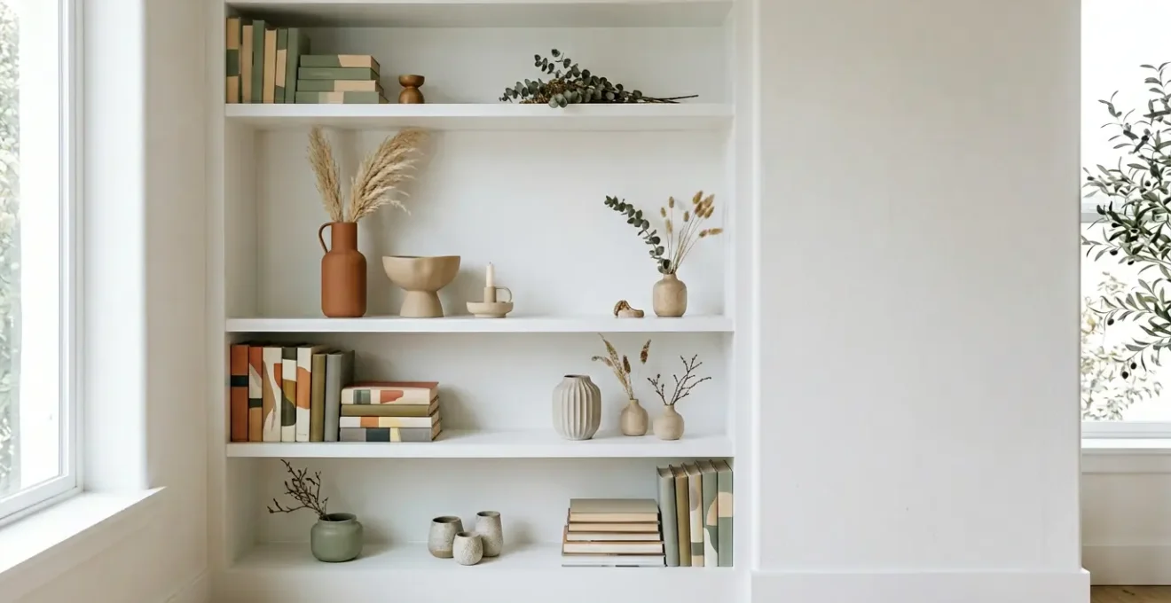
Why does grouping objects in odd numbers create visual harmony?
The « Rule of Three » is one of the most frequently cited principles in design, but its power goes far beyond a simple preference for the number three. The harmony it creates is rooted in psychology. The human brain is hardwired to seek out patterns, and a group of three is the smallest number of items that can be arranged to form a recognisable pattern or a dynamic triangle. This inherent asymmetry is more engaging to the eye than the static, predictable nature of an even-numbered group.
When we see two objects, our brain draws a simple line between them. When we see four, we tend to pair them off. But with three (or five, or seven), our eyes are forced to move around the composition, creating a sense of movement and visual interest. This is why odd-numbered groupings are more appealing and memorable than their even-numbered counterparts. They encourage the viewer to engage, to scan, and to process the individual components as a cohesive whole.
As the image demonstrates, a successful grouping isn’t just about the number; it’s about creating a relationship. Here, a taller ‘lead’ object is supported by two smaller, varied pieces. This creates a visual hierarchy within the small collection. Your eye is drawn to the tallest point, then travels down and across to the other objects, following the lines of an invisible triangle. This is the foundation of a display that feels balanced yet dynamic, intentional yet effortless.
How to connect a vintage vase, modern print and travel souvenir in one display?
The most personal and captivating homes are those that effortlessly blend objects from different eras, styles, and provenances. The challenge is to prevent this eclectic mix from looking like a chaotic jumble. The key is not to force them to match, but to establish a visual narrative that unites them. Think of yourself as a storyteller, and your objects as characters. How can you make them part of the same story? A stylist’s method involves creating subtle, deliberate connections.
Instead of focusing on what makes your vintage vase, modern print, and travel souvenir different, search for what they share. This shared element becomes the thread that ties the composition together. It could be a whisper of colour, a shared textural quality, or an emotional theme. By establishing this connection, you create a dialogue between the objects, inviting the viewer to see them as a curated collection rather than a random assortment.
Here is a practical process for building that narrative cohesion:
- Identify the narrative thread: Before placing anything, decide on the story. Is it « Coastal Memories, » uniting a piece of driftwood, a blue-toned print, and a weathered ceramic pot? Or is it « British Post-War Optimism, » connecting a 1950s vase with a graphic, modern art piece?
- Create a colour bridge: Look for a subtle, secondary colour in your most complex piece, like a modern print. Then, find an object where that same colour appears, perhaps in the patina of a vintage brass box or a detail in a travel souvenir. This creates an immediate, sophisticated link.
- Establish textural dialogue: Contrast is your friend. Pair a smooth, glossy vintage ceramic with the rough, handmade paper of a print or the weathered surface of a stone from a beach. This makes each object’s material quality more pronounced and interesting.
- Use diagonal repetition: Create a subtle rhythm by placing similar tones or forms diagonally across the shelf (e.g., a warm metallic on the upper left and another on the lower right). This guides the eye through the display and creates a sense of unity.
- Layer with intention: Don’t line everything up. Place taller, flatter items like prints at the back, leaning against the wall, and pull smaller, more sculptural objects forward to create depth and dimension.
Original painting or limited-edition print: which holds value in a UK home?
Art is one of the most powerful tools for personalising a space, but navigating the market can be daunting. The choice between an original painting and a limited-edition print often comes down to a balance of budget, aesthetic goals, and investment potential. It’s crucial to distinguish between financial value (what it might be worth in the future) and home value (the immediate aesthetic and personal impact it has on your space). For most homeowners, the latter is far more important.
In the UK home decor market, authenticity and the story of creation are highly prized. A generic, mass-produced canvas from a big-box store may fill a wall, but it carries no narrative and little intrinsic value. Conversely, a numbered, signed, limited-edition print from a reputable studio or a hand-pulled etching tells a story of craft and exclusivity. It provides a direct connection to an artist’s process without the price tag of a one-off original painting. Understanding the hierarchy of art types helps you make an informed decision that aligns with your home’s narrative.
This comparative analysis, based on trends in the UK art and decor market, breaks down the different considerations:
| Art Type | Financial Investment Value | Home Value (Aesthetic Impact) | Typical Price Range (UK) | Authenticity Signal |
|---|---|---|---|---|
| Original Oil Painting (Generic) | Low to Medium | Medium | £500 – £2,000 | Medium (depends on artist recognition) |
| Limited-Edition Screenprint (Reputable Studio) | Medium | High | £150 – £600 | High (numbered, signed, studio provenance) |
| Signed Limited-Edition Giclée | Low to Medium | Medium to High | £100 – £400 | Medium (edition size matters) |
| Unlimited Giclée Print | Low | Low to Medium | £30 – £150 | Low (mass-produced) |
| Hand-Pulled Etching/Lithograph | Medium to High | High | £200 – £1,500 | Very High (traditional craft, limited) |
The mantelpiece overload mistake that makes your living room feel busy
The mantelpiece, especially in period homes with a prominent chimney breast, is a natural focal point. However, its narrow depth and prime location make it highly susceptible to the « overload mistake »—a common tendency to fill every inch with small, competing objects. When everything vies for attention, nothing stands out, and the result is a visual cacophony that makes the entire room feel busy and unsettled. A curated mantelpiece isn’t about how much you can display, but about the power of what you choose to show.
The solution is to establish a clear focal point hierarchy. Instead of a democratic lineup of trinkets, you must assign roles: one star of the show, a few supporting actors, and a minimal chorus. This approach is particularly critical on the narrow mantels of Victorian or Edwardian homes, where horizontal space is at a premium. Here, embracing verticality and practising restraint are the keys to a sophisticated display. The most important element in your composition is often the one you leave out: the negative space.
To rescue your mantelpiece from clutter, follow this stylist’s guide to intentional editing:
- Establish a focal point hierarchy: Choose one primary, dominant object. This is typically a large statement mirror or an oversized art piece that anchors the display. Add one or two secondary objects of medium scale, like an elegant vase or a pair of candlesticks. Finally, limit any tertiary « trinket » items to a maximum of two or three very small, meaningful pieces.
- Embrace verticality over horizontal spread: On a narrow mantel, work with the room’s height. Use tall, slim objects such as a single tall vase or elegant, slender candlesticks. This draws the eye upward and complements the architecture, rather than fighting the limited depth.
- Apply asymmetrical balance: Avoid a perfectly symmetrical, mirrored arrangement, which can look rigid and dated. Instead, use the Rule of Three, grouping objects of varied heights off-centre to create a more dynamic and modern balance.
- Leave intentional negative space: This is the most critical and often overlooked step. Aim to leave at least 30-40% of the mantel surface completely empty. This « breathing room » is not wasted space; it is an active design element that gives the eye a place to rest and allows the chosen objects to have impact.
- Avoid the overload trap: Once your hierarchy is set, be ruthless. Remove any item that does not serve the composition. If an object isn’t the primary focus or a direct supporting piece, it is likely contributing to the clutter.
When should you swap decorative objects to refresh a room without spending?
A truly stylish home feels alive and evolves with the seasons. This doesn’t require a constant budget for new decor. One of the most effective and sustainable styling secrets is to « shop your home, » rotating your existing decorative objects to reflect the changing light and mood of the year. Swapping a few key pieces on a shelf or mantelpiece can dramatically refresh a room’s atmosphere, making you see your own possessions with new eyes. It’s an act of re-contextualization that breathes new life into your space.
The key is to align your swaps with the natural calendar, taking cues from the world outside your window. This approach feels more authentic and grounded than following commercial seasonal trends. In the UK, this means embracing the subtle shifts: the forced bulbs of late winter, the fresh wildflowers of early summer, and the rich, earthy textures of autumn. By creating a small, curated « back stock » of accessories, you can perform these simple swaps in minutes, providing a powerful psychological boost and keeping your interior feeling dynamic and responsive.
A simple seasonal rotation calendar, aligned with the British natural calendar, might look like this:
- Late Winter (January-February): As the festive decor is packed away, fight the gloom by swapping in forced hyacinth or narcissus bulbs in simple pots, pale pussy willow branches in a tall vase, and soft, cream-coloured textiles to signal the coming light.
- Spring (March-April): Display colourful egg cups (even without eggs), small ceramic vases filled with the first daffodils or tulips, and exchange any heavy woollen textures for lighter linen or cotton elements.
- Early Summer (May-June): Fill jam jars with quintessentially British wildflowers like cow parsley or meadow buttercups. Introduce fresh green tones and swap darker pottery for lightweight ceramics in sage or mint.
- Late Summer (July-August): Reflect the feeling of high summer and holidays by incorporating dried grasses, coastal finds like driftwood and shells, and sun-bleached neutral tones that evoke the British seaside.
- Autumn (September-October): As the light turns golden, switch to dried seed heads, small decorative gourds, russet-toned pottery, and bring back warmer textiles like wool or tweed accents in your display.
- Winter (November-December): Before the full festive explosion, create a pre-Christmas wintery feel with evergreen sprigs, mercury glass candleholders for warm light, and deep forest greens and richer textures.
The Pinterest trap that makes 70% of UK living rooms feel impersonal
There is a pervasive sameness creeping into modern interiors, and its primary vehicle is the social media algorithm. Platforms like Pinterest and Instagram are fantastic for inspiration, but they have also created the « Pinterest Trap »: the endless scroll of perfectly styled, yet strikingly similar, rooms. We see a look we admire—perhaps the hugely popular « organic modern » aesthetic—and we click to buy the same vase, the same candle, the same beige cushion. The result is a room that is on-trend but utterly devoid of personality. It tells the story of an algorithm, not a life.
The data shows just how powerful these trends are; one report noted a 157% increase in searches for ‘organic modern style’ in just three months. When a single aesthetic dominates, it encourages a « buy the look » mentality that bypasses the slow, meaningful process of personal collection. It’s the fastest way to create a space that feels generic. A home’s soul comes from the unexpected object, the piece with a story, the item that can’t be added to a digital shopping cart. True style is built, not bought.
This sentiment is echoed by design professionals who see the impact of this trap daily. As Ming Thompson, principal of the award-winning firm Atelier Cho Thompson, explained in an interview with Livingetc:
If you style a shelf with a collection of brand-new matching items from a big-box store, you’re going to have a generic and un-interesting composition. It’s better to layer on a diverse range of objects, new and old.
– Ming Thompson, Principal of Atelier Cho Thompson, interviewed by Livingetc
The antidote to the Pinterest Trap is to use it as a tool for discovering principles (like balance, form, and texture), not for sourcing specific products. It’s about developing your own eye and having the confidence to mix a treasured, albeit imperfect, family heirloom with a modern piece you love. Personal history is the one thing that cannot be replicated, and it is the most valuable accessory you can have.
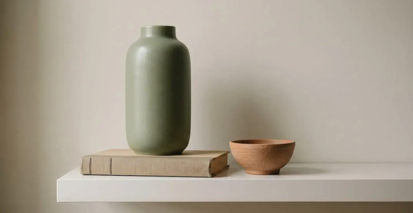
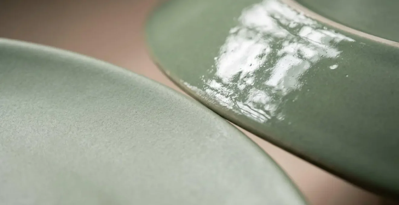
Why does your shiny glaze collection clash while matte pieces harmonise?
You’ve curated a collection of ceramics in a beautiful, cohesive colour palette, yet when placed together on a shelf, they seem to fight with each other, creating visual static. The likely culprit isn’t the colour; it’s the finish. The textural quality of an object—specifically the way its surface interacts with light—is a subtle but powerful element of composition. A collection of high-gloss, shiny glazes can create a surprising amount of visual chaos.
The reason lies in light reflection. A glossy surface acts like a series of tiny, distorted mirrors. It fractures light, creating dozens of sharp, competing points of reflection known as specular highlights. Each highlight is a tiny focal point that distracts the eye. When you group many glossy objects, you create a blizzard of these highlights, preventing the eye from appreciating the form and colour of the pieces themselves. In contrast, a matte finish absorbs and diffuses light. It scatters the light rays softly across its surface, revealing the object’s pure form and colour without the distraction of sharp reflections. This creates a sense of calm, unity, and textural sophistication.
The aesthetic shift towards matte finishes is a defining trend in contemporary design, reflecting a broader desire for minimalism and natural textures. As explained in an analysis on the rise of matte ceramics, this evolution is tied to creating spaces with textural interest without visual clutter. This doesn’t mean you must banish all shiny objects. The key is balance. A single glossy piece placed within a group of matte objects can be a beautiful accent, its shine made more impactful by the contrast. But a shelf dominated by high-gloss finishes will almost always feel busier and less harmonious.
Key takeaways
- Curate, Don’t Decorate: Shift your mindset from filling space to telling a story. Every object should earn its place through personal meaning or compositional value.
- Embrace Asymmetry and Odd Numbers: Use the Rule of Three (or five) to create dynamic, visually engaging groupings that the human eye finds more interesting than static, even-numbered arrangements.
- Master the Mix: Connect disparate objects by finding a common thread—a subtle colour, a contrasting texture, or a shared narrative—to create a cohesive and personal collection.
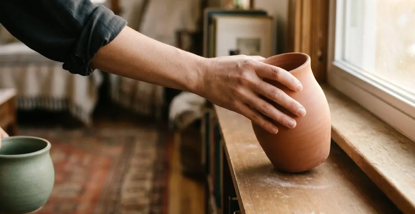
How to style hand-thrown pottery without making your home look like a gift shop?
Hand-thrown pottery, with its unique imperfections and tangible connection to a maker, brings a profound sense of soul to a home. There’s a fine line, however, between a curated collection and a display that resembles a pottery shop’s « for sale » shelf. The « gift shop effect » happens when beautiful, artisanal pieces are lined up like products, stripped of context and purpose. The secret to avoiding this is simple: integration, not just display.
To make hand-thrown pottery feel like a natural part of your home, you must give it a job or a story within the room. A beautiful mug shouldn’t just sit on a shelf; it should be placed on a coaster next to your reading chair, ready for use. A hand-thrown bowl gains personality when it’s by the front door holding your keys. By giving these objects a function, even a symbolic one, you weave them into the fabric of your daily life. This grounds them, giving them a sense of belonging that a purely decorative arrangement can never achieve.
Here are five techniques to integrate hand-thrown pottery with sophistication:
- Give it a purpose: Instead of just displaying pieces, use them. A handmade bowl can hold fruit on the kitchen counter, a small pot can be a pen holder on your desk. Functionality is the enemy of the gift shop aesthetic.
- Contrast rustic with sleek: Place a single, beautifully rustic piece of pottery against a stack of crisp, modern art books with clean spines, or on a minimalist metal shelf. The contrast highlights the unique qualities of both the handmade and manufactured items.
- Curate the imperfections: The beauty of studio pottery is in the slight wobble or the maker’s thumbprint in the glaze. However, too many « imperfect » pieces together can feel chaotic. Choose one or two hero pieces for a single shelf to let their unique character shine.
- Reference the tradition: Deepen your appreciation by understanding the context. A quick search on the British studio pottery tradition, from the functionalism of Leach Pottery to the bold modernism of John Booth, enriches your collection and informs your styling choices.
- Break the lineup: Never arrange multiple similar pieces in a straight row. This is the number one sign of a retail display. Instead, scatter your collection across different rooms, or group them in varied, asymmetrical compositions.
Your curation checklist: from clutter to cohesive story
- The Shelf Audit: Inventory every object on your display. What stories do they tell? Group them by potential themes: travel, family, colour, or texture.
- The Narrative Thread: Choose the single strongest theme. What is the core story you want this shelf to tell right now? Set aside the objects that don’t fit this chapter.
- The ‘Rule of Three’ Test: From your chosen theme, select a group of 3 or 5 objects. Do they vary in height, form, and texture? Does the group feel dynamic?
- The Personal vs. Pinterest Test: Look at your curated group. Is there at least one object that is deeply personal and cannot be bought in a store today? Does it feel like *you*?
- The Final Composition: Arrange your group on the shelf, leaving at least 30% of the surface as intentional negative space. Step back. Does it feel balanced but not static? Adjust until it feels right.
Now that you have the stylist’s framework, the next step is to look at your own shelves with a fresh, curatorial eye. Begin the process today by choosing one small area and applying these principles to transform it into a space that tells your unique story.