Contrary to common advice, you don’t need to choose smaller furniture for a compact space; you need to curate it like a gallery.
- The perceived size of furniture (its visual weight) matters more than its actual dimensions.
- Treating negative space as a design element gives sculptural pieces the « breathing room » they need to make an impact.
Recommendation: Focus on controlling the dialogue between shapes, mastering visual weight, and using lighting to transform your small living area into a sophisticated, functional exhibition.
The enduring challenge for any design enthusiast with a compact flat is the conflict between two desires: the craving for bold, sculptural furniture that acts as art, and the practical need for functional seating that doesn’t induce claustrophobia. The conventional wisdom for a 20m² living room often involves a retreat into diminutive, « space-saving » pieces that feel like a compromise, sacrificing personality for the sake of perceived openness. You’re told to buy glass tables, backless sofas, and furniture that apologises for its own existence.
But what if this approach is fundamentally flawed? What if the secret to balancing a dramatic, form-driven coffee table with comfortable seating isn’t about shrinking your ambition, but about expanding your understanding of space itself? The key lies not in the dimensions you measure with a tape, but in the volumes you perceive with your eyes. It requires a shift in mindset from homeowner to curator, where every piece is chosen for its silhouette and its relationship to the void around it.
This guide will deconstruct the principles of visual curation, moving beyond generic tips to provide a strategic framework. We will explore the science of visual weight, the psychology of shape, and the practicalities of ergonomic comfort. By mastering these concepts, you can transform your small space into a powerful statement of personal style, where form and function exist not in opposition, but in a perfectly balanced, artful dialogue.
To navigate this exploration of form and function, this article is structured to build your curatorial skills. The following sections will guide you through the core principles, common mistakes, and expert strategies for making sculptural furniture work, even in the most compact of spaces.
Summary: A Curator’s Guide to Balancing Form and Function in Compact Spaces
- Why Does Your Designer Chair Look Cramped Despite a Large Living Room?
- How to Elevate a Sculptural Side Table for Maximum Visual Impact?
- Curved or Angular Silhouettes: Which Softens a Boxy UK New-Build Living Room?
- The Period-Mixing Mistake That Makes Statement Furniture Look Out of Place
- When Do UK Showrooms Launch Limited-Edition Sculptural Furniture Collections?
- Why Does Your Hallway Feel Narrower After Adding a Statement Arch?
- The Oversized Armchair Mistake That Makes Your Reception Room Feel Cramped
- How to Choose a Statement Chair That Still Feels Comfortable After 2 Hours?
Why Does Your Designer Chair Look Cramped Despite a Large Living Room?
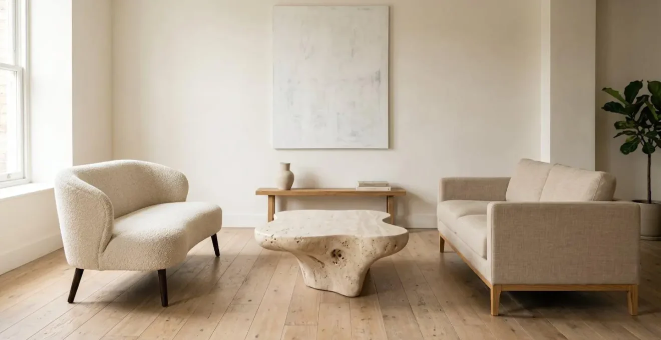
The answer often has little to do with the actual square footage of your room or the dimensions of your chair. The culprit is a more subtle, yet powerful, principle: visual weight. This refers to the perceived heaviness or mass of an object. A piece with high visual weight commands more attention and appears to occupy more space, regardless of its physical footprint. Factors like colour, pattern, and form contribute significantly. A dark, solid, blocky armchair has a much higher visual weight than a larger, open-framed sofa with slim legs and light-coloured upholstery.
Understanding this concept is the first step towards becoming a curator of your own space. Instead of asking « Does it fit? », you should ask « How heavy does it feel? ». According to interior design research, a boxy, blocky armchair in a solid fabric can command more visual real estate than a sofa that is technically larger but appears lighter. This is why a beautifully designed statement chair can sometimes feel oppressive, not because it’s too big, but because its visual density is out of balance with the rest of the room.
If something’s not correct about the visual weight in a space, you feel it the moment you walk into the room. It’s the difference between making a space look and feel harmonious or not.
– Laura Hammett, LivingEtc interview on visual weight in interior design
To correct this, you don’t necessarily need a smaller chair. You could instead balance its high visual weight by surrounding it with elements of low visual weight, such as a leggy side table, a simple floor lamp, or by ensuring there is ample negative space around it. This empty space acts as a frame, allowing the chair’s form to be appreciated rather than feeling like it’s crowding the room. It’s a game of perceptual balance, not just physical placement.
How to Elevate a Sculptural Side Table for Maximum Visual Impact?
A sculptural side table should be more than just a surface for a cup of tea; it should be a focal point, a piece of functional art. In a compact space, achieving this requires intentional curation rather than accidental placement. The goal is to create a curated vignette that enhances the table’s form and transforms it into a deliberate statement. This is achieved through the masterful interplay of lighting, scale, and texture. Forget flooding the area with ambient light; a sculptural piece demands its own spotlight.
This is where principles from gallery lighting come into play. A small, focused spotlight from the ceiling or a low-profile art light can be directed onto the table. This technique casts dramatic shadows that accentuate its unique silhouette, revealing the contours and material textures that might otherwise be lost. The table is no longer just furniture; it is an illuminated sculpture.

The objects placed on the table are equally important. Instead of clutter, think in terms of a composition. A few carefully chosen items with contrasting scale and texture create visual interest. Consider pairing the smooth, cool surface of a marble table with a single, oversized dried botanical stem in a minimalist vessel, or a tiny, intricate vintage brass box. The contrast makes each object, and the table itself, more compelling. This deliberate styling ensures the table commands attention for its artistic merit, making the most of its impact within your 20m².
Curved or Angular Silhouettes: Which Softens a Boxy UK New-Build Living Room?
Many modern UK homes, especially new-builds, are defined by their « boxiness »—sharp corners, flat surfaces, and rectangular volumes. While efficient, this architectural language can sometimes feel sterile or rigid. Introducing sculptural furniture offers a powerful antidote, and the choice between curved and angular silhouettes can fundamentally alter the room’s atmosphere. While angular, geometric pieces can create a bold, modernist statement, it is the curved silhouette that truly excels at softening a boxy interior.
Curves interrupt the monotony of straight lines. A round coffee table, a sofa with a gently bowed back, or an armchair with soft, rounded arms introduces a sense of flow and organic movement. This « silhouette dialogue »—the conversation between the angularity of the room and the fluidity of the furniture—creates a dynamic visual tension that is both sophisticated and welcoming. The eye follows the curve, providing a sense of relief from the rigid grid of the walls and windows.
The impact is not just visual; it’s psychological. In spaces with hard edges, soft forms can feel more comforting and natural. In fact, research on furniture forms demonstrates that environments with curvy furniture evoked more positive emotions, such as feeling relaxed and happy, than those with rectangular furniture. By choosing a sculptural coffee table with a soft, kidney-bean shape or a circular form, you are not just making a design choice; you are actively cultivating a more serene and inviting emotional landscape within your home.
The Period-Mixing Mistake That Makes Statement Furniture Look Out of Place
One of the most common ways a beautiful piece of statement furniture fails is not due to its own design, but its relationship with its neighbours. Placing a hyper-modern sculptural table next to a traditional Victorian armchair can look less like a deliberate, eclectic choice and more like a happy accident that went wrong. The mistake is not the mixing of periods itself, but the lack of a cohesive design narrative to bridge the gap between them. Without a unifying element, the pieces fight for attention, and the overall composition feels chaotic and disjointed rather than intentionally curated.
To make period-mixing work, you must create a visual link that tells a story. This « bridge » can be colour, texture, material, or even a shared sense of form. For example, a piece of abstract art on the wall that contains the colour palettes of both the modern and antique furniture can tie the whole scheme together. Similarly, using a common finish, like matte black metal, on the legs of a new table and the frame of an old mirror, can create a subtle but powerful sense of unity.
The key is to make the contrast feel purposeful. You are the editor of your space, and every choice should reinforce your central theme. This requires a strategic approach to ensure that each piece, no matter its origin, contributes to a single, harmonious story.
Your Action Plan: Creating a Cohesive Narrative with Mixed Periods
- Identify a ‘bridge’ element: Select abstract art containing colours from both furniture pieces, or choose a rug with patterns that feel both modern and traditional.
- Unify through texture and finish: Apply a common finish (e.g., matte surfaces) to link a new powder-coated metal table with an old unvarnished wooden chest.
- Build a personal narrative: Create a story that makes the contrast feel purposeful (e.g., ‘This rococo mirror was my grandmother’s; this minimalist chair represents my future’).
- Use negative space strategically: Give each statement piece breathing room so the deliberate contrast registers clearly rather than appearing accidental.
- Establish visual hierarchy: Decide which piece is the primary focus and arrange supporting elements to reinforce that intentional decision.
When Do UK Showrooms Launch Limited-Edition Sculptural Furniture Collections?
For a true design enthusiast, acquiring a piece of sculptural furniture is about more than just a transaction; it’s about discovering a future classic, often before it reaches mainstream consciousness. Sourcing unique, limited-edition collections in the UK requires a strategic approach tied to the international design calendar. Major brands and independent makers time their most significant launches around a few key global events, with ripples felt in London showrooms weeks and months later.
The design year effectively kicks off in April with Salone del Mobile in Milan. This is the world’s premier design fair, where major trends are born and the most anticipated collections are unveiled. By following the coverage online, you can spot emerging designers and limited editions that will likely become available through high-end UK retailers later in the year. It’s your first look at the pieces that will define the conversation.
June brings 3daysofdesign in Copenhagen, a festival with a strong focus on Scandinavian and international innovation in sculptural and material-led furniture. It’s a prime opportunity to discover brands that blend minimalist aesthetics with bold, artistic forms. Finally, the focus shifts home in September for the London Design Festival. This is when UK showrooms, from Clerkenwell to Brompton, launch their own exclusive collections and collaborations, often timed to coincide with the influx of international design press and buyers. Beyond these major events, a dedicated enthusiast should keep an eye on a few other key sources:
- Graduate Shows: Scout talent at year-end shows from prestigious institutions like the Royal College of Art (RCA), Central Saint Martins, and even Design Academy Eindhoven. This is where you can acquire pieces from future stars before their market value soars.
- Online Platforms: Ongoing curation happens on platforms dedicated to collectible design. Websites like 1stDibs, Pamono, and The Future Perfect are essential resources for sourcing unique and studio-made functional art.
- Social Media: Following hashtags like #collectibledesign, #functionalart, and #studiomade on Instagram is a direct line to independent makers and small studios producing incredible work outside the traditional showroom system.
Why Does Your Hallway Feel Narrower After Adding a Statement Arch?
Introducing a strong architectural element like a statement arch into a narrow hallway seems like a bold, character-building move. Yet, it can often backfire, making the space feel more constricted and obstructed rather than more grand. The reason lies in visual termination. If the arch acts as a visual « full stop, » the eye halts there, perceiving it as a barrier. The hallway’s apparent length is truncated, and the space feels shorter and therefore narrower. The secret to success is to treat the arch not as a wall, but as a threshold—a frame through which the eye is actively drawn.
This is achieved by manipulating light, colour, and what lies beyond. First, consider the arch’s finish. Painting the interior curve of the arch in a satin or semi-gloss finish, while keeping the front face matte, allows it to catch and reflect light, creating dimensional depth. This subtle sheen prevents the arch from looking like a flat, solid mass. It begins to feel like a portal.
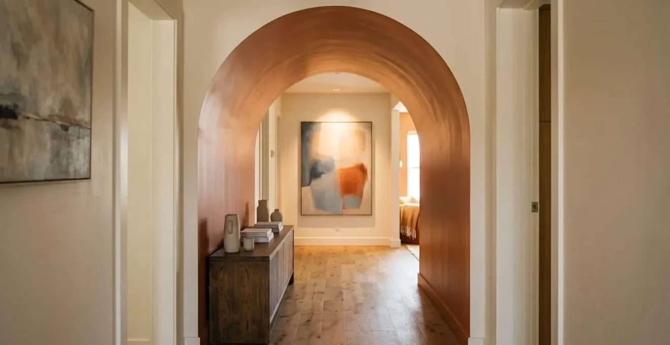
Most importantly, you must create a compelling « terminus point » visible through the archway. This is a visual reward that pulls the gaze through the space. A strategically placed piece of artwork bathed in warm, focused light, a glimpse of a vibrant wall colour in the room beyond, or even a beautiful decorative object on a console table will encourage the eye to travel forward. This creates a sense of passage and depth, making the hallway feel longer and more inviting. The arch becomes part of a journey, not the end of the road.
The Oversized Armchair Mistake That Makes Your Reception Room Feel Cramped
Placing a large, comfortable armchair in a small reception room is a common desire. The mistake isn’t the ambition for comfort, but the failure to manage the chair’s immense visual density. As we’ve established, a solid, bulky form can dominate a room, making it feel cramped and unbalanced, even if there’s technically enough space to walk around it. The key is not to abandon the idea of an oversized chair, but to choose one that is large in comfort but « light » in its visual presence, and to position it with a deep respect for the room’s invisible pathways.
The first strategy is to choose a chair with visible legs. An armchair, no matter how bulky its seat, that is raised off the floor on elegant legs instantly appears lighter. This allows light and sightlines to pass underneath, breaking up the solid mass and creating an illusion of spaciousness. Conversely, a skirted armchair that goes all the way to the floor creates a heavy, immovable block. Material choice is also critical. The same chair in a dark, smooth leather will have a far higher visual density than one upholstered in a light-coloured, textured fabric like bouclé or linen, which tends to recede into the background.
Finally, placement must respect the room’s natural flow. Before placing the chair, map out the primary « desire lines »—the paths people will naturally take from the door to the sofa, or to the window. The oversized chair must be positioned to the side of these traffic lanes, never obstructing them. A clearance of at least 75-90cm (30-36 inches) should be maintained for major walkways to ensure the room remains functional and doesn’t feel like an obstacle course. By managing both the chair’s inherent visual properties and its spatial context, you can have both generous comfort and a sense of openness.
Key Takeaways
- Visual weight, not physical size, determines how « big » a piece of furniture feels in a room.
- Treating negative space as a deliberate framing device is essential for showcasing sculptural forms.
- The dialogue between curved and angular silhouettes can fundamentally change a room’s emotional atmosphere.
How to Choose a Statement Chair That Still Feels Comfortable After 2 Hours?
The great tragedy of many a « statement » chair is that it is designed for the eye, but not for the body. Its breathtaking sculptural form looks magnificent in a showroom, but after sitting in it for more than twenty minutes, you find yourself shifting uncomfortably, your lower back aching. A truly successful statement piece in a functional living space must be a marriage of aesthetics and ergonomics. The challenge is that the best ergonomic features are often subtle and invisible, hidden within the chair’s beautiful lines.
When assessing a potential chair, you must become a tactile detective. Run your hand along the inside of the back—is there a gentle, S-shaped curve that will provide lumbar support, or is it fashionably, painfully flat? Look at the front edge of the seat cushion. A well-designed chair will have a « waterfall » edge, a soft, downward curve that prevents the seat from cutting into the back of your thighs and restricting circulation. This single detail can be the difference between hours of comfort and minutes of discomfort.

Pay close attention to the chair’s geometry. The seat depth and the seat pitch (the angle at which the seat tilts back) are crucial. A seat that is too deep will leave your feet dangling, while one that is too shallow offers no thigh support. A slight backward pitch is ideal for a lounge chair, as it encourages a relaxed posture. Finally, test the armrests. Are they at a height where your arms can rest naturally, with your shoulders relaxed? Or do they force your shoulders up towards your ears? Choosing a chair that successfully integrates these ergonomic details into its sculptural form is the ultimate curatorial triumph—it is proof that beauty does not have to be painful.
Ultimately, curating a small space with sculptural furniture is an act of confidence. It’s about rejecting the notion that compact living requires timid choices. By understanding and applying these principles of visual weight, silhouette dialogue, and ergonomic intelligence, you can create a home that is not only functional but also a deeply personal and artistically resonant gallery. Start today by evaluating one piece in your home not by its size, but by its presence.